 ASPNetWorld

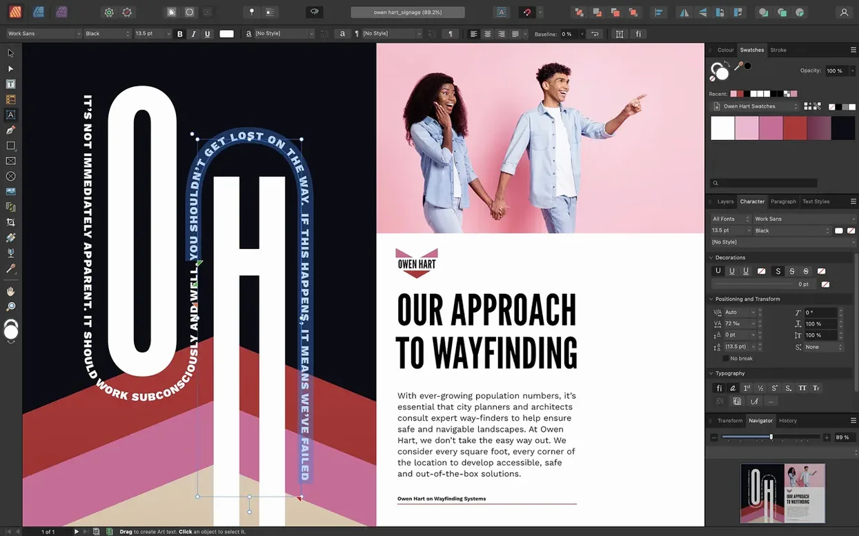
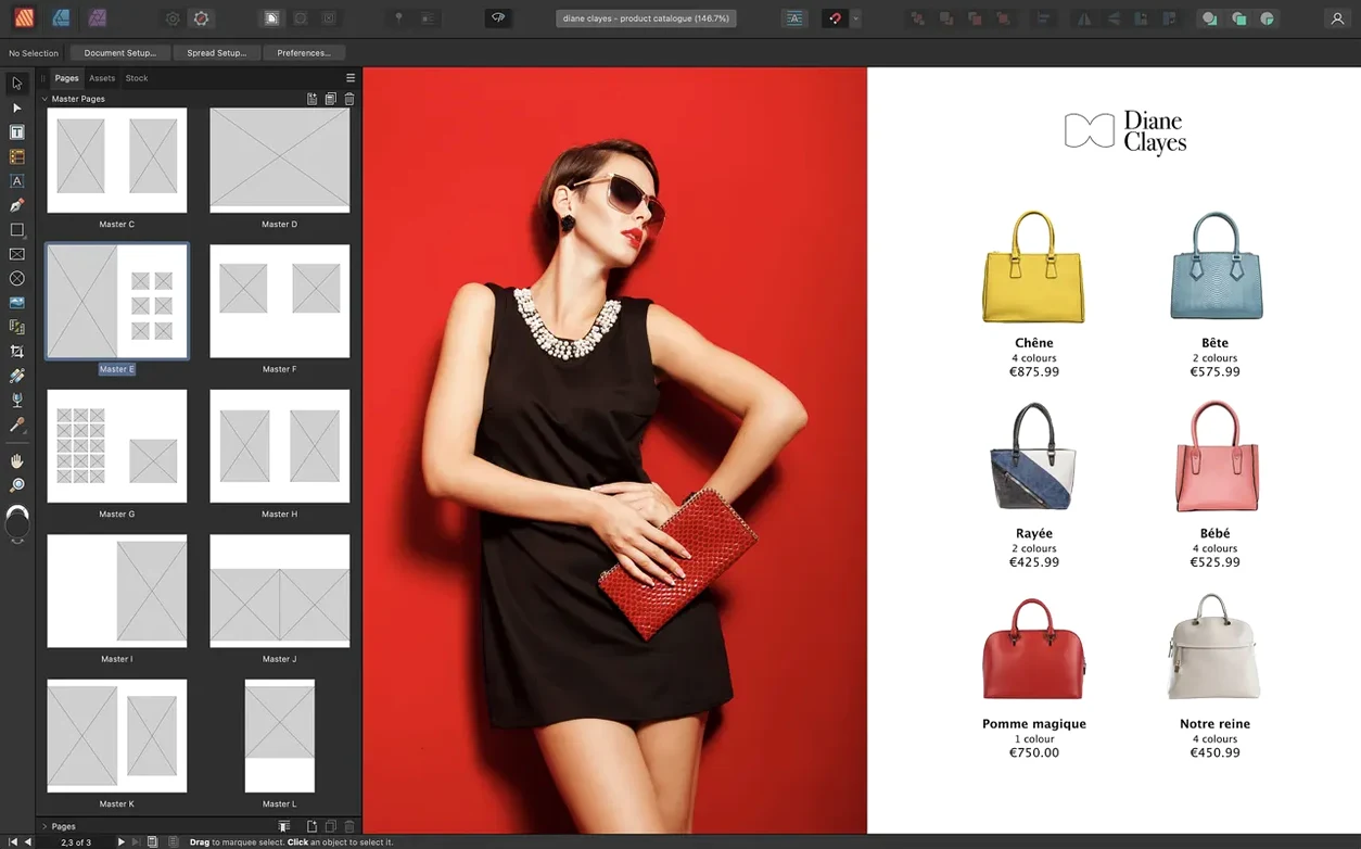
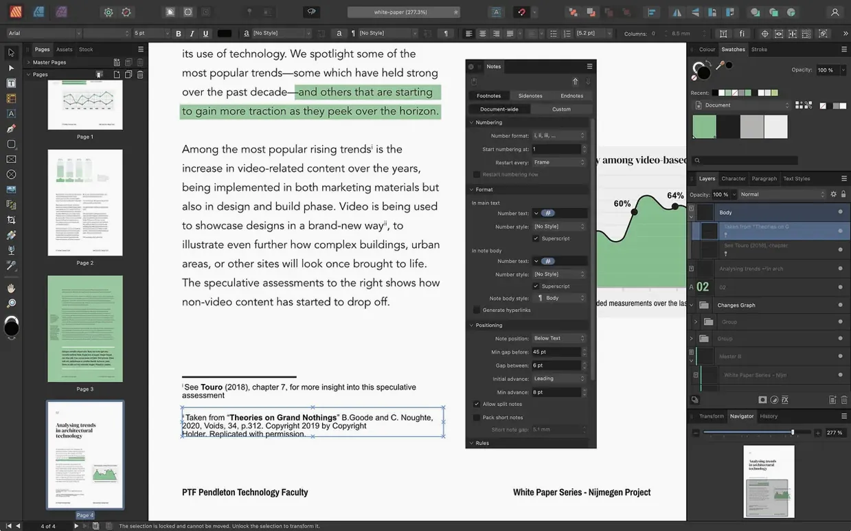
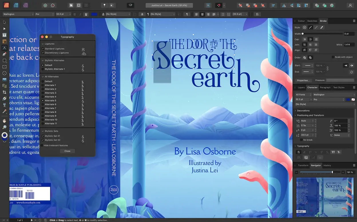
It runs on any Mac with an Apple M-series chip or an Intel processor, as long as you're on macOS 10.15 or later.
Compatibility at a glance
Apple Silicon — runs natively on M1, M2, M3 and M4 chips, so the app feels responsive even with multi-page spreads full of high-res images.
Intel Macs — still supported with the 64-bit build. An i5 from the last few years handles most layouts comfortably, though 8 GB of RAM makes a real difference once you start layering vector curves over placed photographs.
macOS version — needs 10.15 Catalina or newer. If you've held off upgrading, Catalina's the cutoff.
What's in the toolbox
Page spreads — version 2.6 added multiple-page spreads and foldable layouts like gatefolds, trifolds and accordion folds, so you're not limited to simple facing pages.
Typography — full OpenType support, character and paragraph styles, plus CMYK and spot colour handling with the Pantone library built in.
Vector tools — the Pen and Node tools let you draw and refine curves directly on the page rather than switching to a separate illustration app.
Images — place or embed images, then manage them alongside tables with custom table formats.
Accessibility — the new Reading Order panel gives you control over PDF tags, handy if your documents need to meet accessibility standards.
Mistakes beginners make (and how to sidestep them)
Newcomers often treat Affinity Publisher like a word processor with pictures. That habit leads straight to frustration. The app thinks in frames — text frames, picture frames, shape frames — and until that clicks, everything feels slightly wrong. A beginner will click the Type tool, drag out a rectangle half the page width, and wonder why text won't flow into the next column automatically. The fix is learning to link frames: click the little triangle on the right-hand edge of a text frame, then click inside another frame, and the story threads through. Once you've done it twice, it sticks.
Another classic slip is ignoring master pages entirely. Someone builds a 32-page brochure, realises the page number is missing on page 17, and proceeds to add it manually to every single spread. A master page — especially the nested masters introduced earlier — would have done the job once. It's worth setting up your running headers, folios and column guides on a master before you place a single image. Retro-fitting is tedious.
Colour catches people out too. A document set up in RGB looks glorious on screen, but when it heads to a commercial printer the blues go muddy. Before you start, check File > Document Setup > Colour and choose CMYK or a spot colour workflow if that's where the job is headed. The Pantone library is sitting right there; use it early.
Finally, linked images. Beginners sometimes drag a dozen hefty TIFFs straight onto the page, then wonder why the file balloons to half a gigabyte. Affinity Publisher defaults to embedding, but switching to linked images in the document setup keeps the working file light and lets you update photographs externally without re-importing.
A typical working session, step by step
Imagine a Thursday afternoon. You've been handed a folder of Word documents, a batch of photographs from a photographer's Dropbox, and a rough pencil sketch of an eight-page newsletter for a local music festival. The headline act changed three hours ago — welcome to layout work.
You open Affinity Publisher and create a new document. The sketch calls for three gatefold spreads, so you head into the Spread Setup and pick a trifold from the foldable spread options that arrived in version 2.6. The page origin is set to the top-left of the first panel; guides snap into place automatically for the fold lines. You save the file as "Festival_Newsletter.afpub" and start building masters.
A parent master holds the festival logo and a thin orange rule along the bottom edge. A second master, nested beneath it, adds page numbers and a date slug. You apply the nested master to all eight pages with two clicks. The structure is solid before a single article has been placed.
Next, text. You create a text frame on page two, import the band profile from a .docx, and watch the overflow indicator turn red. No problem — you draw a second frame on page three, link them via the outflow triangle, and the text threads across the spread. Character and paragraph styles get defined as you go: "Body – Garamond 10/14," "Headline – Franklin Gothic Heavy," and a drop-cap style for the opening paragraph of each article.
Images come in via Place Image Tool. You drop a drum-kit photograph into a picture frame, nudge it with the pan control inside the frame, and wrap the surrounding text around the drummer's silhouette using the Text Wrap panel with edge detection. A quick adjustment layer dials back the exposure without altering the original file — non-destructive editing, right there on the layout.
By four o'clock the headline act has changed again. You update the text frame on page one, re-link the replacement photo, and because you used paragraph styles, every headline in the document keeps its formatting. You export a PDF/X-4 for the printer and a screen-resolution copy with the Reading Order panel checked over for the festival's website. The whole job took three hours, and most of that was waiting for copy.
What the latest versions changed in everyday use
The jump to version 2.6 brought three practical shifts that affect daily work rather than spec sheets. Multiple-page spreads ended the tyranny of two-page thinking. Before, a concertina leaflet meant separate single-page layouts and a lot of mental folding; now the whole spread sits in front of you as one continuous canvas, and the fold lines are just guides you can snap to. A trifold brochure feels like a trifold, not three disconnected pages.
The Reading Order panel arrived quietly but changed things for anyone who regularly outputs tagged PDFs for screen readers or accessibility compliance. Instead of exporting the document and hoping the tagging algorithm made sensible choices, you can open the panel, drag items up or down the reading order, and assign tags — heading, paragraph, figure — directly. It's a small addition that removes a large post-export headache.
Foldable spreads, including gatefolds and accordion folds, turned what used to be a workaround into a native feature. Previously you'd set up a custom page size three times wider than normal and draw your own fold marks. Now the app knows where the folds are, and it adjusts guides and page numbering accordingly. If you produce event programmes, menus or invitation suites, that change alone probably shortened your setup time by half.
How it compares with similar Mac apps
Affinity Publisher vs. Adobe InDesign. InDesign remains the industry benchmark, and its long-standing integration with Creative Cloud, XML workflows and third-party plug-ins is something Affinity hasn't matched. But Publisher covers perhaps ninety percent of what a magazine or book designer does day to day — master pages, text styles, tables, OpenType, linked images, export-ready PDFs — without the subscription model. The StudioLink integration with Affinity Designer and Photo also means you can switch to vector or pixel editing inside the same file, which in InDesign requires launching separate applications.
Affinity Publisher vs. Swift Publisher. Swift Publisher aims at a different crowd: home users and small businesses who want a template-driven approach. It's simpler, with drag-and-drop pre-designed layouts for flyers, newsletters and social media graphics. What you gain in speed you lose in depth — no linked text frames, no nested masters, no Pantone library, no foldable spreads. If you're doing a one-off church bulletin, Swift Publisher is the quicker route. If you're designing a 60-page magazine that will go to a commercial printer, Affinity Publisher is the tool that won't hit a ceiling halfway through.
Affinity Publisher vs. Scribus. Scribus is the open-source wild card, and it shares some DNA: CMYK support, spot colours, PDF/X export. It's free and cross-platform, which is appealing, but the interface feels like it stopped evolving a decade ago, and the learning curve is steep even by desktop-publishing standards. Affinity Publisher's more modern foundation — real-time preview, StudioLink, the 2.6 spread features — makes it the smoother ride for most Mac users.
A workflow from start to finish: producing a short-run poetry chapbook
Say you're putting together a 24-page chapbook for a local poet. The final print run will be 150 copies on a digital press, saddle-stitched, with a colour cover and black-and-white interiors. The poet has sent you twenty poems as a single TextEdit file and a handful of scanned ink drawings.
1. Document setup. You create a new document: 24 pages, facing spreads, A5 finished size. Colour space is CMYK with an FOGRA39 profile. You check "Prefer linked" for image placement so the scanned drawings don't bloat the working file. Margins are generous — 12mm all round, with a 15mm inside bleed for the saddle stitch.
2. Master pages. A left-hand master and a right-hand master, each with the page number in Baskerville Italic and a thin rule running vertically near the spine. A separate master for the title page and colophon, clean of headers.
3. Text flow. You paste the poems into a single text frame on page three, then thread frames across the remaining spreads. Paragraph styles are defined: "Poem Title – Baskerville Bold 14pt," "Poem Body – Baskerville 11/15," and "Attribution – Baskerville Italic 9pt." The poet's name gets a character style that applies small caps via OpenType.
4. Art placement. The ink drawings come in as linked TIFFs. Each one sits in a picture frame with a keyline border, set to scale the image proportionally. Where a drawing needs to sit mid-poem, you use the Text Wrap panel with a tight contour so the verse flows around the artwork rather than jumping over it.
5. Cover design. The front cover uses a separate spread — a single page in the document, printed on heavier stock separately — with the book title set in large type and a full-bleed photograph placed behind it. The back cover holds a short blurb and a barcode placeholder.
6. Accessibility check. Before export, you open the Reading Order panel. The poems are tagged as paragraphs, the titles as headings, the drawings as figures. A quick drag reorders one stray attribution that had slipped below a drawing in the tag tree.
7. Export and proof. You export a PDF/X-4 with crop marks and 3mm bleed. A quick check in Preview confirms the pagination, then the file goes to the printer. The whole project, from blank document to print-ready PDF, fits comfortably into an afternoon.
Version 2.6 brings proper support for multi-page and foldable spreads — gatefolds, trifolds and accordion folds are all on the menu now, which opens up layout possibilities beyond the standard facing pages. There's also a dedicated Reading Order panel for tagging PDF content, something you'll appreciate when a client asks for an accessible document.
- macOS 10.15 Catalina or later
- Apple M-series chip or 64-bit Intel processor
- 8 GB RAM recommended
- Up to 2.8 GB available hard drive space (more during installation)
- Display resolution 1280×768 or higher
Questions I keep hearing
Does Affinity Publisher 2 work on Apple Silicon Macs?
Yes, it runs natively on Macs with M1, M2, M3 and M4 chips, as well as Intel-based Macs with a 64-bit processor.
What's the oldest macOS version it supports?
You need macOS 10.15 Catalina or later. Anything older won't run the current version.
Can I set up foldable page spreads?
Version 2.6 introduced foldable spreads including gatefolds, trifolds and accordion folds, alongside multiple-page spread support.
Questions from the class 0
Sign in or join the class to ask a question.
Nobody has asked anything yet. If you have used it on a real job, say what the file did.
Also on the Mac Apps shelf
The whole Mac Apps shelf Affinity Photo
Edits photos nondestructively with selective adjustments and raw processing.
Affinity Photo
Edits photos nondestructively with selective adjustments and raw processing.
 Affinity Designer
Turns rough sketches into crisp, scalable vector artwork and layouts.
Affinity Designer
Turns rough sketches into crisp, scalable vector artwork and layouts.
 AI Transcription
Converts batches of spoken recordings into searchable written text.
AI Transcription
Converts batches of spoken recordings into searchable written text.
 Aiarty Image Enhancer
Cleans up noisy or soft photos with targeted detail reconstruction.
Aiarty Image Enhancer
Cleans up noisy or soft photos with targeted detail reconstruction.
 Aiarty Video Enhancer
Lifts old, grainy video into clearer, watchable footage.
Aiarty Video Enhancer
Lifts old, grainy video into clearer, watchable footage.
 Adobe Premiere Rush
Trims phone footage into a finished video with minimal fuss.
Adobe Premiere Rush
Trims phone footage into a finished video with minimal fuss.
 AirBuddy
Shows your AirPods battery status instantly in the menu bar.
AirBuddy
Shows your AirPods battery status instantly in the menu bar.
 Airflow
Queues up local video files for uninterrupted, hands-off playback.
Airflow
Queues up local video files for uninterrupted, hands-off playback.