 ASPNetWorld

You can run FontLab 8.4 natively on any Intel Mac from macOS 10.14 Mojave upwards, and it is fully optimised for every generation of Apple Silicon chip. That covers everything from a dusty 2012 Mac mini to a current Mac Studio, which means your font development pipeline stays consistent no matter what hardware sits on your desk.
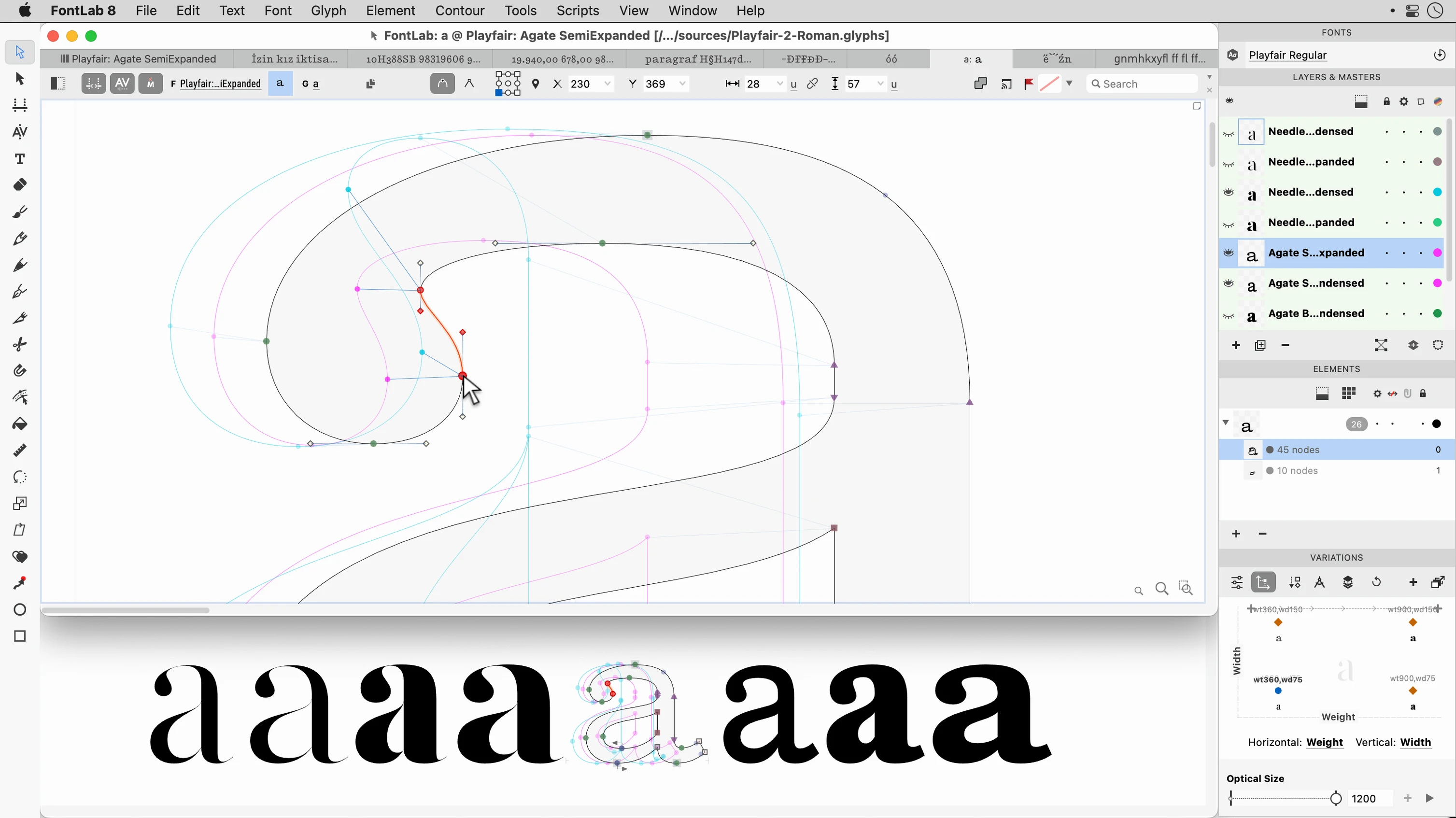
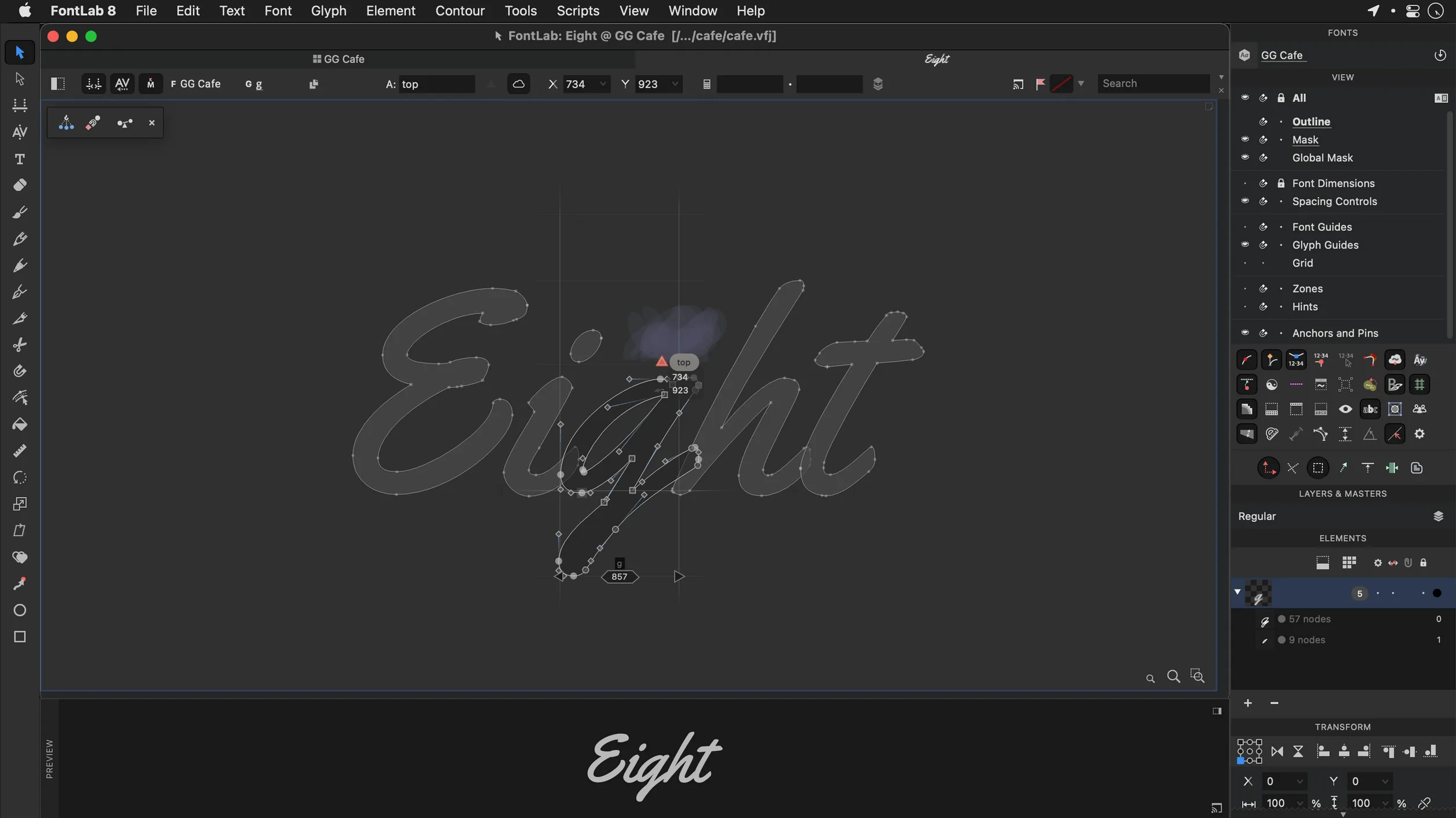
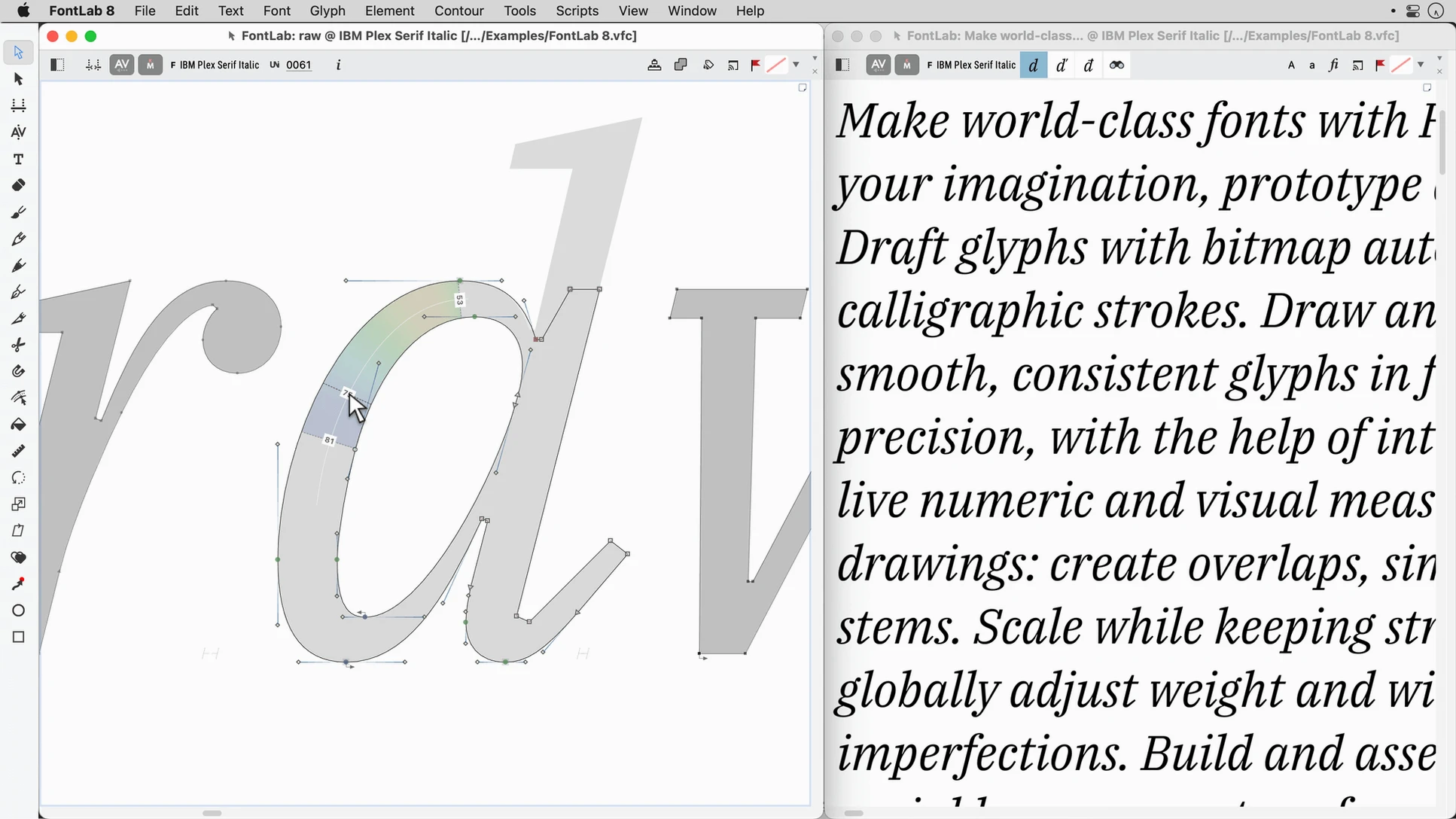
The vector drawing tools form the real heart of the editor. They work the way a Bezier pen should, with direct on-canvas manipulation, live corner rounding, and a responsive snapping engine that makes quick work of stem weights and serif construction. The toolbox borrows ideas from both classic font editors and modern illustration apps, so the muscle memory you already have translates straight onto the glyph canvas.
A programmable transformation engine sits behind each contour. Instead of nudging individual points, you can apply rules across an entire typeface—scale, slant, interpolate, or run custom scripts over hundreds of glyphs in one batch pass. The same batch logic handles complex script support too. Building Arabic or Hebrew families becomes a matter of setting substitution rules and testing them immediately inside the built-in viewer, with right-to-left shaping rendered live as you adjust your marks.
Everything is backed by a generous undo history of more than 200 levels, which encourages the sort of playful experimentation you need when kerning a display face or tuning TrueType hinting. Whether you are outputting a clean OpenType CFF family, a TrueType AAT font for legacy Mac documents, or a variable-weight experiment with three masters, the export pipeline gives you precise control over naming, outlines, and table-level options without hiding anything behind a wizard.
Treating glyphs as standalone drawings instead of a related system
Newcomers coming from vector illustration software often treat glyphs as isolated drawings, which leads to a family that looks stitched together rather than unified. The real power of FontLab lies in its metrics, sidebearing relationships, and the way contours talk to one another across a font. A simple shift in thinking saves months of rework: you are not drawing a single letter—you are designing a system.
Another classic misstep is ignoring the vertical metrics early on. A designer will perfect every lowercase ‘a’ and then discover the entire set sits too low on the line when the font hits a web browser. Set your ascender, descender, and line gap values deliberately before you finish the first dozen glyphs, then test with a live composing panel. The built-in preview window updates as you tweak, so you catch the drift immediately rather than in a PDF export three weeks later.
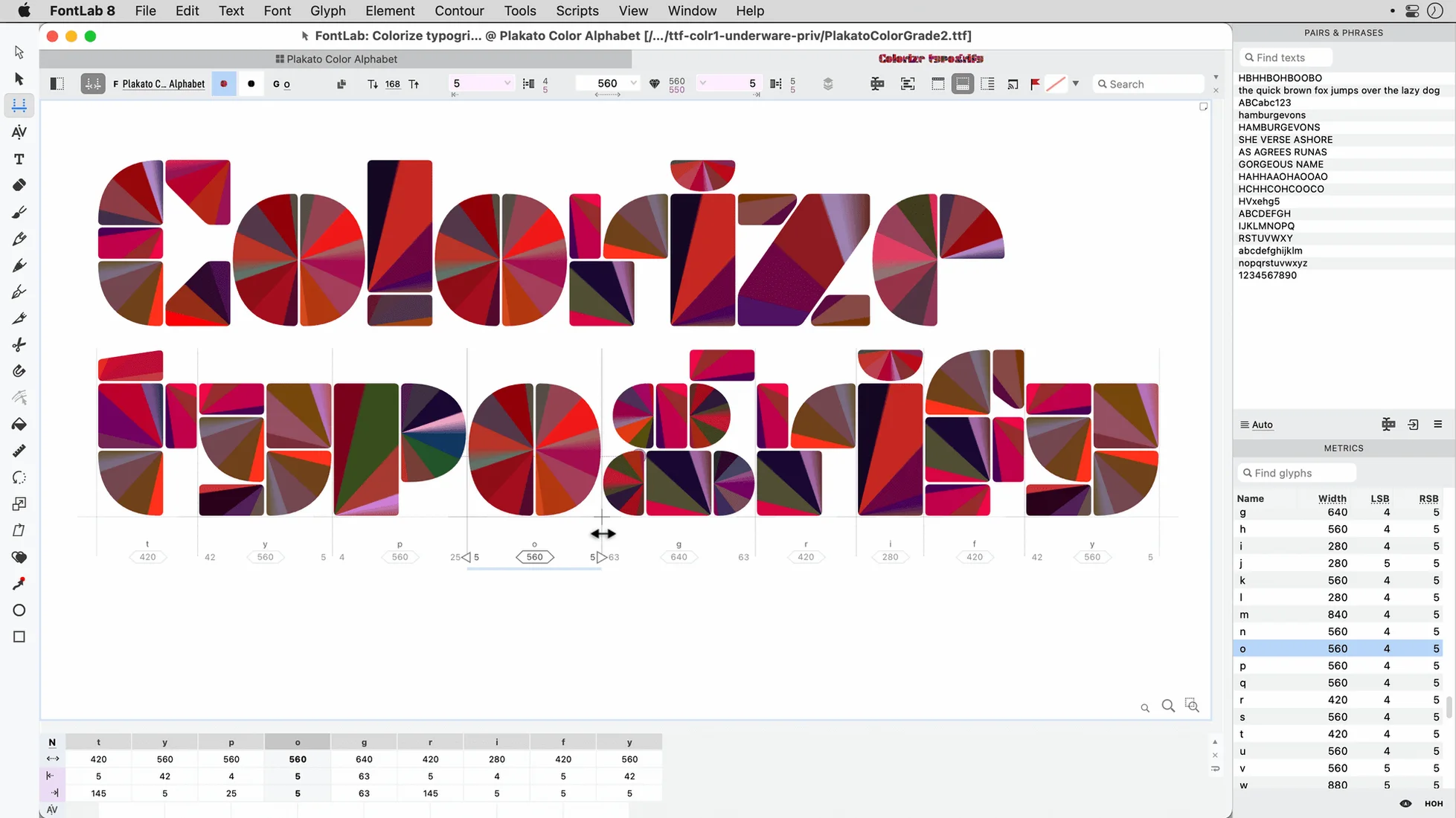
Beginners also lean too heavily on the default sidebearing values without understanding how they compound across a word. Automatic metrics get you started, but the real rhythm of a typeface comes from patiently kerning pairs—‘AV’, ‘To’, ‘ry’—and then letting FontLab’s class-based kerning spread that intelligence across the family. Skipping this step leaves a font that technically works but feels lumpy to a reader’s eye.
Building a small-caps companion from an existing serif
Imagine you have a finished serif text face and need a small-caps cut for book chapter openings. Start by duplicating your source font as a new project; never hack the original file. The workflow runs from glyph selection through to export in a single focused session.
Use the glyph search bar to isolate the lowercase set, then scale the entire group to roughly 70% of cap height using the batch transformation panel. The numerals and punctuation usually need a similar treatment so they align optically. This is where the snapping engine earns its keep: as you drag each scaled glyph into position, the baseline and x-height guides confirm your caps and small caps share the same visual centre without floating or sinking.
Next, adjust stem weights. A uniform scaling makes thin strokes too delicate and thick strokes too heavy relative to the full-size capitals. Use the contour offset tool with a small positive value on the scaled lowercase, then manually tune the junctions where bowls meet stems. The live corner rounding controls let you soften any sharp transitions that appeared during scaling.
Switch to the kerning panel and load the existing pair list from the parent font. Many pairs—like ‘A’ followed by a small-cap vowel—will need rebalancing because the proportions have shifted. Run through the list in the preview window, with the metrics histogram open, until the spacing matches the rhythm of the original capitals. Export as an OpenType CFF file with a stylistic set feature tag, and your layout application can call the small caps from a single menu pick.
Opening a half-finished geometric sans to build the bold weight
You open FontLab with a half-finished geometric sans that needs a bold weight. The workspace loads your last arrangement: the main glyph window on the left, the preview panel docked to the right, and the metrics histogram tucked underneath.
First, you select the uppercase ‘O’ and the lowercase ‘o’ as your control characters. These two shapes establish the weight, roundness, and spacing logic for the entire bold. You increase the stem thickness using the parallel curve tool, which pushes both sides of a contour outward while preserving the original curve shape. Watching the preview panel, you check that the counters haven’t closed up at text sizes.
With the master shapes set, you select the entire uppercase alphabet, numerals, and basic punctuation in the font window. The batch transformation panel applies the same contour thickening, but you tick the “preserve sidebearing ratios” checkbox—this keeps the spacing proportional so ‘H’ doesn’t end up tighter than ‘M’. The operation takes about six seconds on a thousand glyphs, and you still have 198 undo levels left if something goes odd.
The rest of the session splits between two tasks. You spot-check diacritic positioning, because accented capitals like ‘É’ inherit their mark anchors from the light weight and often need a small vertical nudge. Then you move to the kerning window, where the class-based system already knows that ‘T’ and ‘o’ need a negative pair from the light master. You tweak the value slightly looser for the bolder weight, test a pangram in the preview, and save the .vfc file. Total elapsed time is under forty minutes.
How FontLab fits with other apps and macOS features
FontLab sits comfortably in a macOS design pipeline that includes vector editors, layout apps, and the operating system’s own font handling. You can drag AI or EPS outlines directly from Affinity Designer or Illustrator onto a glyph cell, and the pasteboard recognises the contour data without intermediate file exports. That makes iterating on a logotype in your favourite drawing app perfectly natural—sketch broadly, refine precisely in FontLab, then test in a live document.
The built-in viewer previews any installed system font alongside your work-in-progress, so comparing your new slab serif against Georgia or your sans against SF Pro happens inside the same window. macOS Font Book integration means FontLab respects the system’s font validation settings; you can temporarily activate a test export without permanently installing it, which keeps your font menus clean during early drafts.
When you need to proof a family across a real layout, export a test OpenType file to a watched folder and set InDesign or Pages to use that folder as a local font source. As you re-export from FontLab, the layout document picks up the changes after a quick application restart. This round-trip is especially useful when tuning tabular figures for annual reports or checking that your italic angle matches the slant of a corporate wordmark.
For script-heavy projects—Arabic, Hebrew, or anything with contextual shaping—FontLab’s shaping engine mirrors what HarfBuzz-based apps like Firefox and Chrome do at rendering time. You can set up substitution rules, switch the preview direction to right-to-left, and see exactly how marks attach in connected text. No surprises when the font ships, because what you see in the glyph window is what the browser gets. People who search for a fontlab 8 download often want that exact confidence across print and screen, and this integration is what delivers it.
Version 8.4 consolidates a huge engineering effort since the original FontLab 8 release, delivering roughly 500 improvements that span the drawing tools, the export pipeline and the user interface responsiveness. If you are still on FontLab 7, the jump is even more significant—close to 900 changes have landed across the entire 8.x cycle, touching everything from Apple Silicon performance to batch-processing reliability.
- macOS 10.14 Mojave or later
- Intel or Apple Silicon Mac
Questions I keep hearing
Which script systems does FontLab 8 handle for complex shaping?
The editor includes dedicated support for Arabic and Hebrew, with live right-to-left previewing, mark positioning tools, and the ability to define substitution rules that you can test directly inside the built-in font viewer.
Questions from the class 0
Sign in or join the class to ask a question.
Nobody has asked anything yet. If you have used it on a real job, say what the file did.
Also on the Mac Apps shelf
The whole Mac Apps shelf Folder Preview Pro
Lets you peek inside folders without fully opening them.
Folder Preview Pro
Lets you peek inside folders without fully opening them.
 ForkLift
Moves files between folders and servers in a dual-pane view.
ForkLift
Moves files between folders and servers in a dual-pane view.
 FotoMagico
Builds timed slideshows that feel more like short films.
FotoMagico
Builds timed slideshows that feel more like short films.
 Flicker Free
Removes flicker and strobing from your video footage.
Flicker Free
Removes flicker and strobing from your video footage.
 FxFactory Pro
Adds a library of video effects to your editing software.
FxFactory Pro
Adds a library of video effects to your editing software.
 Find Any File
Scans your disks directly to find files the Finder misses.
Find Any File
Scans your disks directly to find files the Finder misses.
 Garden Planner
Helps you lay out planting beds and garden features before digging.
Garden Planner
Helps you lay out planting beds and garden features before digging.
 Final Cut Pro
Tracks moving objects so titles and blurs follow them automatically.
Final Cut Pro
Tracks moving objects so titles and blurs follow them automatically.