 ASPNetWorld
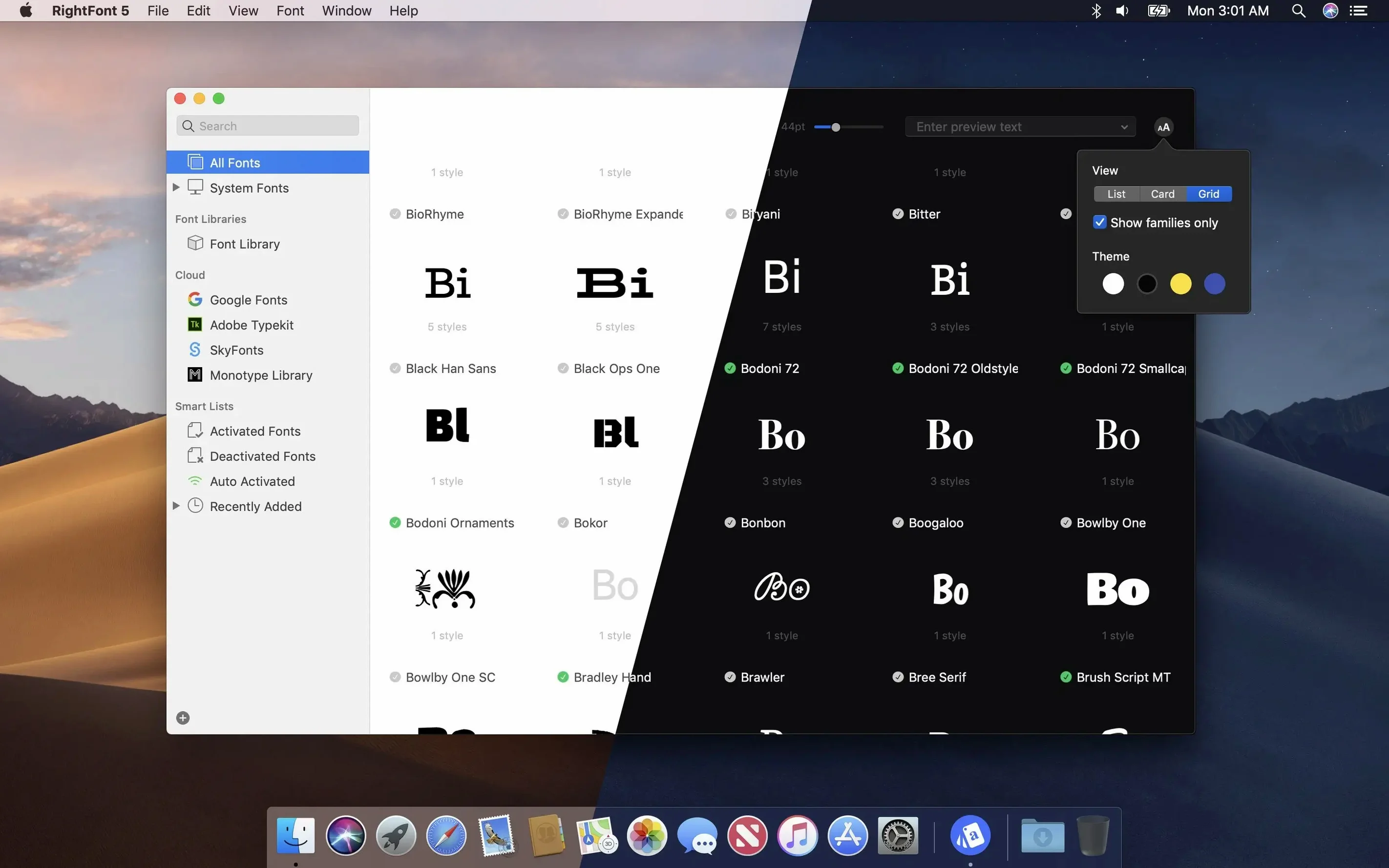
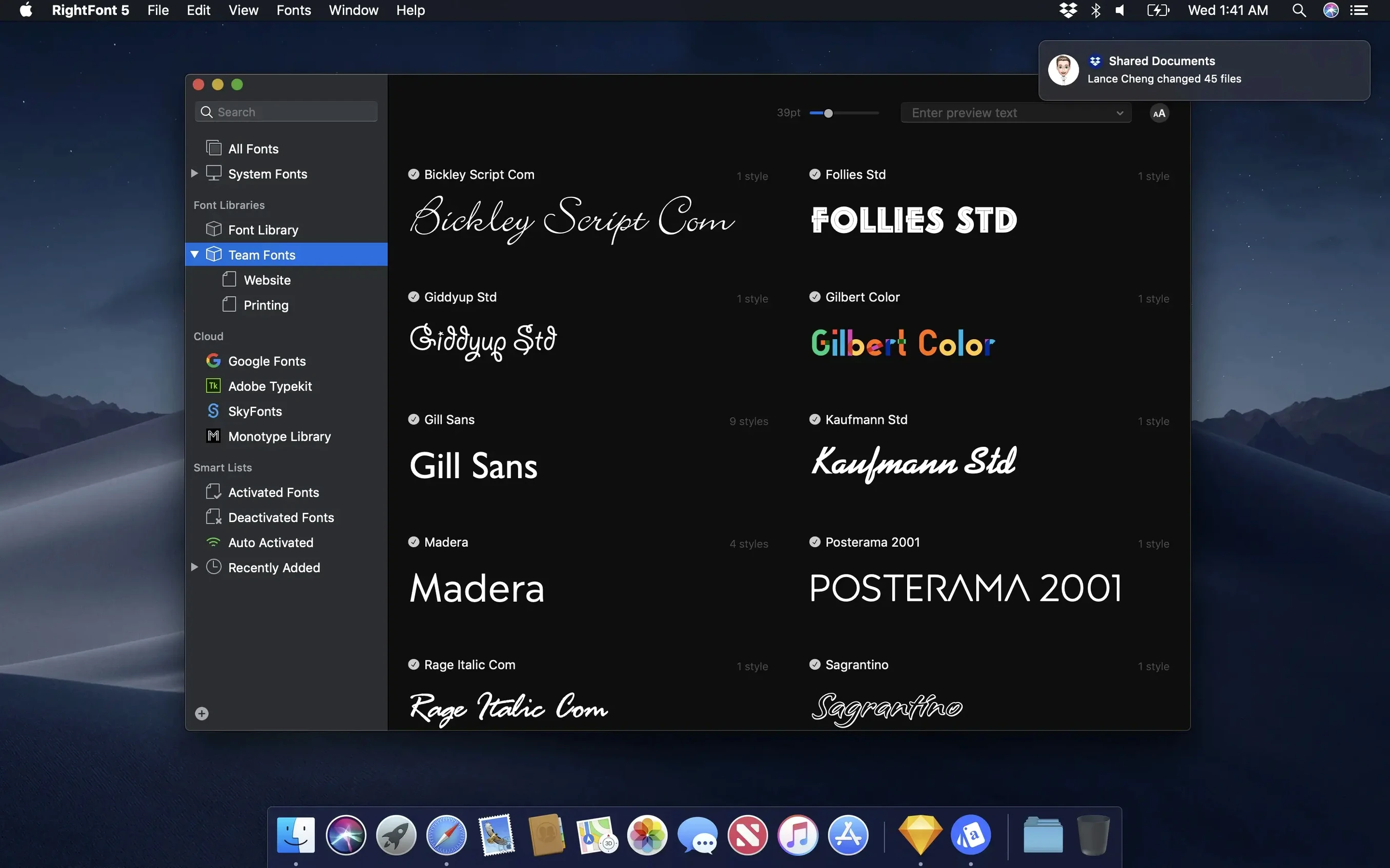
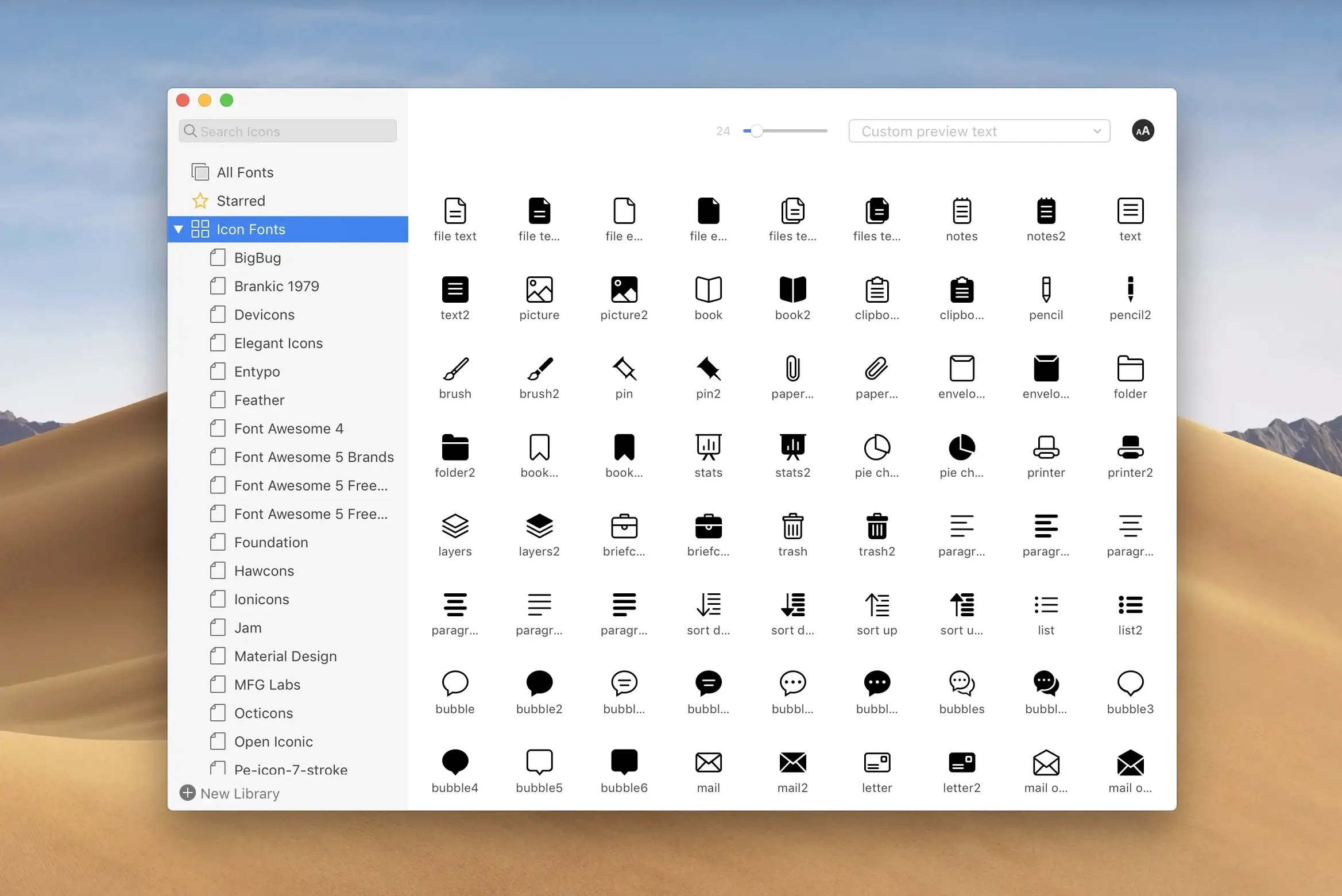
If you live inside Adobe Illustrator or Sketch, you already know the Font menu is a place where organisation goes to die. RightFont replaces that scrolling list with a live, searchable library that sits in your menu bar, and the real power emerges once you move beyond basic browsing.
How does instant filtering change a font search?
Results appear as you type, but the deeper trick is filtering by classification, width and weight without opening a single panel. You can narrow a thousand fonts to a handful of condensed serifs in seconds, then see them rendered against your own sample text before you commit.
Can you activate fonts without leaving a design layout?
Yes, and this is where the menu bar workflow earns its place. With a text layer selected in Adobe Illustrator or Sketch, double-clicking a font inside RightFont changes the layer immediately. No dropdown menus, no guessing which weight renders correctly — just direct, in-context switching.
What makes the tag system useful for a large collection?
Version 10.2.1 tightened tag management considerably. You can now drag subtags back into the main Tags section, which makes restructuring a messy library feel less like filing and more like a quick tidy-up. Combined with auto-activation for design documents, a well-tagged collection stays out of the way until the exact moment a project calls for it.
Version 10.2.1 smooths import and tag friction points
The headline features in version 10.2.1 sound modest — better imports, tag tweaks, a handful of fixes — but they smooth out friction points that had been nagging regular users for months. The import process now shows a finalisation stage and a count of unsupported files, which sounds dry until you remember the old frustration of dragging in a folder of two hundred fonts and wondering whether the silence meant success or failure. Knowing exactly which files were skipped saves a forensic dig through the library later.
Tag management received a small but telling change: you can drag a subtag back into the main Tags section. Before this, reorganising meant deleting and re-creating tags, a chore that made people reluctant to tidy up as a project evolved. Now the structure can breathe — a client-specific subtag that outlives its parent project slides neatly into the general pool. And if you work in Adobe Illustrator or QuarkXPress, the fixes for those apps mean fewer moments where a carefully chosen font simply refuses to activate mid-layout, which is the sort of invisible improvement you only notice because the swearing stops.
Finding a condensed geometric logotype on a Tuesday afternoon
Imagine a Tuesday afternoon. A branding brief lands asking for a logotype with a condensed geometric feel, and the client has sent a mood board full of references you half-recognise. You open RightFont from the menu bar and type "geometric sans" — six matches from your installed collection. You narrow by width: condensed and suddenly there are only two. You type the client's tagline into the preview field and watch both render in real time. Neither feels quite right.
So you head to a font list you built six months ago for a packaging job, labelled "Sharp Grotesk alternatives." You drag it into the current workspace, activate the whole list with one click, and switch across to Illustrator where a text frame is waiting. Selecting the frame and double-clicking each candidate inside RightFont cycles the text layer instantly — no dropdown hunt, no scrolling through Illustrator's alphabetically chaotic menu while the creative director peers over your shoulder. The fourth font lands. You add a "Branding – Q3" tag to the handful you tested, then drag a "Rejected" subtag back to the main section because it was cluttering the project view. The whole search took under four minutes.
Auto-activation for designers switching between Adobe and Sketch
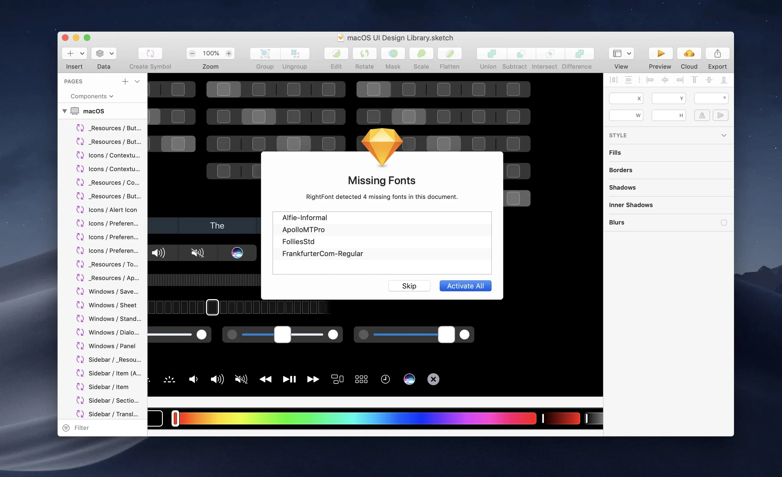
Type designers and full-time typographers are the obvious candidates, but the tool really shines for people who bounce between Adobe apps and Sketch throughout a working day. If you open a layout file and twenty fonts are missing, RightFont's auto-activation pulls them from your library without a manual hunt. This alone saves a freelancer a dozen tedious minutes per project handover.
Teams managing shared brand assets benefit from the font list export — a designer can package a project's typefaces into a single transferable list, and a colleague on a different Mac picks up exactly the same set without hunting through email attachments. Menu bar addicts, too: the sort of user who keeps a clipboard manager and a launcher running will find the lightweight menu bar access more natural than launching a full application window every time they need to preview a single weight. And if you teach design, the ability to filter by classification — serif, sans, script, display — turns font selection into a teachable moment rather than a scroll-and-pray exercise.
Avoid importing every typeface at once
The most common stumble is treating RightFont like a system Font Book replacement and importing every typeface on the machine in one go. That works technically, but you lose the advantage of the filtering system when your library is an undifferentiated swamp. A better approach: import in chunks tied to projects or styles, and tag each batch as it arrives. Even three tags — "serif-working," "sans-client," "display-experimental" — will make the instant search behave like a curator rather than a warehouse.
Another mistake is ignoring the auto-activation settings. RightFont can watch specific applications and activate fonts automatically when a document requests them, but only if you tell it which apps matter. New users often leave this unconfigured, then wonder why InDesign keeps throwing missing-font warnings while the typefaces sit perfectly available in the RightFont library. Spend two minutes in preferences, tick the design apps you use, and the background activation does the rest.
Finally, the preview text field is often left at "The quick brown fox" for weeks. Type in your project's real copy — a brand name, a headline, a navigation label — and the right font announces itself far more honestly than a pangram ever could.
Version 10.2.1 is a stability and refinement release. Font imports are more reliable, and the import window now shows a finalisation stage plus a count of unsupported files, so you are not left guessing about failed items. Tag management has been improved — subtags can be dragged back to the main Tags section, which makes reorganising a large library noticeably smoother. The update also includes fixes for Adobe Illustrator, QuarkXPress, and macOS 27.
- macOS 11 or later
- Compatible with Intel-based Macs and Apple silicon Macs
Questions from the class 0
Sign in or join the class to ask a question.
Nobody has asked anything yet. If you have used it on a real job, say what the file did.
Also on the Mac Apps shelf
The whole Mac Apps shelf Rider
Builds .NET and Unity projects in a cross-platform IDE.
Rider
Builds .NET and Unity projects in a cross-platform IDE.
 Rhino
Models precise 3D forms for design and manufacturing.
Rhino
Models precise 3D forms for design and manufacturing.
 Remove-It
Uninstalls apps and removes their leftover files.
Remove-It
Uninstalls apps and removes their leftover files.
 Raycast Pro
Launches apps and commands from a keyboard palette.
Raycast Pro
Launches apps and commands from a keyboard palette.
 Screen Studio
Records your screen while automatically smoothing cursor movement and trimming silence.
Screen Studio
Records your screen while automatically smoothing cursor movement and trimming silence.
 ScreenFlow
Captures and edits screen recordings, then turns your clicks and taps into animated callouts.
ScreenFlow
Captures and edits screen recordings, then turns your clicks and taps into animated callouts.
 RAR Extractor
Previews and extracts compressed archive contents.
RAR Extractor
Previews and extracts compressed archive contents.
 RAR Extractor - unzip
Extracts files from compressed archives like RAR and ZIP.
RAR Extractor - unzip
Extracts files from compressed archives like RAR and ZIP.