 ASPNetWorld

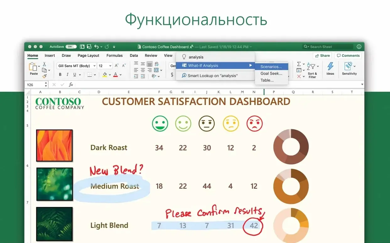

Microsoft Excel is a spreadsheet application for building, editing, and collaborating on workbook files — the heavy-lifting number cruncher that’s been part of office life for decades.
What does version 16.93 add to the mix?
The headline changes are a refreshed set of charts and a feature called Ideas, which scans your data and suggests visualisations and trends you might otherwise miss. Think of it as a second pair of eyes that’s surprisingly good at spotting patterns in a column of figures.
Does the core experience still feel familiar?
Absolutely. The formula bar, ribbon, cell formatting, and pivot-table logic all behave exactly as long-time users expect. The update layers fresh intelligence on top of a workflow that hasn’t been turned upside down, so muscle memory still counts for something.
What about performance and Mac support?
This build runs natively on both Apple Silicon and 64-bit Intel machines, which keeps large workbooks responsive. It’s built for macOS 13 and later, and you’ll find the interface localised into more than twenty languages, from Russian and Greek to Japanese and Czech.
Typing numbers feels safe until a date format ruins your table
Excel’s surface is friendly enough that you can start typing numbers straight away, but that inviting grid hides a few traps that trip up newcomers. None of them are fatal, yet they can turn a ten-minute table into an hour of head-scratching.
Ignoring cell references that drift
The most common slip is dragging a formula down a column without pinning the bits that shouldn’t move. A simple =B2*C1 turns into =B3*C2 on the next row, and suddenly your VAT calculation references the quantity instead of the rate. The fix is the dollar sign — $C$1 locks both column and row, C$1 locks just the row. Get into the habit of asking “should this reference travel?” before you copy anything.
Merged cells as a quick layout fix
Merging cells feels like a tidy way to centre a title, but it wrecks sort ranges, breaks copy-paste, and confuses formulas that expect a clean grid. The alternative that seasoned users reach for is “Center Across Selection” in the Format Cells dialog — same visual result, no structural damage.
Data that looks like numbers but isn’t
Excel can store what appears to be a number as text, especially when data arrives from a CSV export or a web scrape. The giveaway is a tiny green triangle in the corner of the cell, or a SUM function that returns zero. Select the offending range, use the warning flag that pops up to “Convert to Number,” and check that leading apostrophes haven’t sneaked in.
Overconfidence in the default chart
Selecting a block of data and hitting the chart button produces something that usually needs a rethink. The default clustered column chart rarely suits time-series data, and pie charts with twelve slices are a readability disaster. Spend sixty seconds asking what question the chart is meant to answer, then pick a type that fits — line for trends, bar for comparisons, scatter for relationships.
Skipping named ranges
Beginners often write formulas that point at Sheet1!$A$2:$A$243 and then waste time decoding what that range actually means a week later. Highlight the cells, type a name in the box left of the formula bar, and you can write =SUM(QuarterlySales) instead. It makes formulas self-documenting and reduces errors when ranges grow.
How Excel fits into a wider macOS workflow
Excel doesn’t live in isolation. On a Mac, it plays surprisingly well with other tools once you know where the handshakes happen.
Numbers and the art of the quick import
If a colleague sends an Apple Numbers file, you don’t need to ask for a re-send. Open Numbers, choose Export To > Excel, and the resulting .xlsx file lands with most formatting and formulas intact. The translation isn’t perfect — conditional highlighting rules sometimes go awry — but for financial models and data tables it’s reliable.
Shortcuts and Automator
The macOS Shortcuts app can trigger Excel actions: open a specific workbook, run a recorded macro, or extract a named range and pass it to another step in a shortcut chain. Pair that with Automator’s Folder Actions and you can build a watch folder that takes every CSV dropped into it, opens it in Excel, applies a standard formatting template, and saves an .xlsx copy to a “Processed” folder.
PowerPoint and the paste-special dance
Copying a chart from Excel and pasting it into PowerPoint usually embeds the entire workbook inside the presentation. That’s convenient for portability but bloats the file. Use Paste Special > Paste Link instead, and the chart stays connected to the source spreadsheet — update the numbers, and the slide updates itself next time both files are open.
Outlook and mail-merge muscle
Excel can act as the data source for a Word mail merge, which means your contact list or invoice run lives in a workbook and feeds directly into email templates via Outlook. The key is keeping the worksheet flat: one row per recipient, no blank rows, and column headers that Word can map cleanly to merge fields.
Quick Look and Finder integration
Select an .xlsx file in Finder and tap the space bar — Quick Look pops up a read-only preview of the first sheet. It’s not a substitute for opening the app, but for checking which version of a budget you’re about to attach to an email, it saves half a dozen clicks.
Fixes for the support-ticket moments that stump experienced users
Even experienced users run into baffling moments. Here are the ones that generate the most support tickets, boiled down to practical fixes.
“Excel quit unexpectedly” on launch
Nine times out of ten, this traces back to a corrupted preference file. Quit Excel, go to ~/Library/Preferences/, find com.microsoft.Excel.plist, and move it to the desktop. Relaunch the app — it’ll create a fresh preference file, and you can delete the old one if everything works. If the crash persists, hold the Shift key during launch to bypass any auto-loaded workbooks.
Formulas showing as text instead of calculating
You type =SUM(A1:A10) and Excel just sits there displaying the formula like a stubborn receipt. The cell is almost certainly formatted as Text. Set the format to General, then click into the formula bar and press Return to re-enter it. If an entire column has gone text-mad, use Text to Columns on the Data tab with no delimiter selected — it forces Excel to re-evaluate every cell.
Scrolling that jumps by whole screens
Some Mac users discover that a two-finger trackpad swipe sends the worksheet flying instead of nudging a few rows. That’s a macOS scroll-acceleration quirk. In System Settings, under Accessibility > Pointer Control > Trackpad Options, try toggling scrolling speed or inertia. Inside Excel, the keyboard shortcut Fn+Arrow keys gives you precise movement as a fallback.
Printing that produces eight pages of white space
The culprit is usually a stray cell with a space character or a border format sitting in row 10,000. Switch to Page Break Preview (View tab) and you’ll see the dotted blue line extending way past your actual data. Drag it back to surround only the populated area, or use the Page Layout tab to set a defined print area.
Compatibility warnings when sharing with Windows colleagues
Excel for Mac supports most of what the Windows version does, but certain ActiveX controls, Power Pivot data models, and some VBA library calls don’t translate. The Compatibility Checker (Tools menu) flags these before you send the file. For collaborative work, stick to standard form controls and avoid referencing Windows-specific file paths in macros.
A management accountant opens the monthly sales workbook on a Wednesday morning
Picture a Wednesday morning. You’re a management accountant and the monthly sales workbook has just landed in your inbox, courtesy of the regional teams. Here’s how the next hour plays out.
You double-click the file; Excel launches in under three seconds on an Apple Silicon Mac and lands you on the summary sheet. Before touching anything, you save a dated copy — Sales_Report_2025-03.draft.xlsx — so the original stays pristine. Old habit, zero regrets.
The first job is a quick integrity check. You select the raw-data sheet and tap Ctrl+Shift+End to jump to the last cell. The row count matches what the email promised: 4,812 rows. You spot-check three random rows against the email figures, then run a quick =COUNTA() on the date column to confirm no blanks have crept in.
Next, you notice the Ideas button glowing on the Home tab. You click it with the data range highlighted, and a side panel opens with four suggested charts — one of them catches a weekly dip in the northeast region that nobody mentioned in the commentary. You jot a note to flag it in the board pack.
Time to build the pivot table that powers the summary. You insert it on a fresh sheet, drag Region into rows and Revenue into values, then add a slicer for Product Category. A quick tweak to the number format (Accounting, no decimals) and the table looks boardroom-ready. You copy it and use Paste Link into the summary sheet so it stays dynamic.
With the numbers locked, you turn to the commentary. You want to reference a specific total from the pivot without hard-coding it, so you use =GETPIVOTDATA — a function that looks intimidating but really just needs the pivot table name, the value field, and one row-label pair. Type =GETPIVOTDATA( and click the pivot cell you want; Excel writes the rest.
Before sending, you run the Compatibility Checker, confirm nothing is flagged, and save. You attach the workbook to an Outlook email, add a two-line summary in the body, and hit send. The whole session took about forty minutes, and the only moment of friction was remembering the exact syntax for the pivot-data function — which AutoComplete solved as soon as you typed the opening parenthesis.
A focused workflow: building a departmental budget tracker from scratch
Let’s walk through a specific task — creating a budget tracker that three department heads will fill in each month, with a consolidated view that updates automatically. The goal is something that takes twenty minutes to build and survives a year of use without breaking.
Step one: structure the data sheet. Open a blank workbook and name the first sheet “RawData.” The columns you’ll need: Month, Department, Category, Budget, Actual, Variance. Format Month as a date (mmm-yyyy to keep it tidy), Budget and Actual as currency, and leave Variance as a formula column: =Actual-Budget. This flat table structure is what makes pivot tables and charts work later — resist the urge to split departments across separate sheets.
Step two: add data validation. Select the Department column, open Data > Data Validation, and choose List. Type the three department names separated by commas. Now anyone filling in the sheet picks from a dropdown instead of typing “Marekting” by mistake. Do the same for Category with five or six common cost types.
Step three: lock the structure. Select all cells that users should fill in (the date and value columns) and open Format Cells > Protection, then untick Locked. Now protect the sheet (Review tab > Protect Sheet) with a password. The formula columns, headers, and dropdown lists are safe from accidental edits.
Step four: build the consolidation pivot. Insert a new sheet called “Summary,” add a pivot table sourced from the RawData table, and place Department in rows, Month in columns, and Variance in values. Apply conditional formatting with a three-colour scale — red for overspend, white for on-budget, green for under. The whole picture fits on one screen.
Step five: add a trend sparkline. Next to the pivot, in a blank cell, insert a line sparkline that references the monthly total row. It gives you a tiny, wordless indicator of whether spending is creeping up or staying flat — useful for the email summary that goes to the finance director.
Step six: share it sensibly. Save the workbook to a shared OneDrive folder and use the Share button in the top-right corner. Send the link to the department heads with “Can Edit” permission. Because the raw data lives in one table and the summary is a separate sheet, their monthly entries flow into the pivot without them ever needing to touch the consolidation logic.
Step seven: the monthly refresh ritual. When each new month’s figures arrive, you open the workbook, confirm the new rows have appeared, right-click the pivot and choose Refresh, then check the sparkline has extended. Total time from opening the file to a board-ready summary: under two minutes.
The beauty of this setup is that it uses only features that have been in Excel for years — tables, pivot tables, data validation, and conditional formatting. Nothing fragile, nothing that breaks when the file moves between Mac and Windows, and nothing that requires a macro to maintain.
Version 16.93 introduces new chart types alongside an Ideas pane that analyses selected data and proposes visual summaries and trend indicators automatically.
- macOS 13 or later
- Apple Silicon or 64-bit Intel processor
Questions I keep hearing
Will the Ideas feature work on an ordinary data set, or does it need a special layout?
It works on any well-structured table with clear headers — highlight the range and Excel suggests charts, pivot-table summaries, and trend summaries without any extra setup.
Questions from the class 0
Sign in or join the class to ask a question.
Nobody has asked anything yet. If you have used it on a real job, say what the file did.
Also on the Office shelf
The whole Office shelf Microsoft Office
Brings together the core apps for documents, spreadsheets and email.
Microsoft Office
Brings together the core apps for documents, spreadsheets and email.
 Microsoft Outlook
Manages your email, calendars and contacts in one place.
Microsoft Outlook
Manages your email, calendars and contacts in one place.
 Microsoft PowerPoint
Builds slide decks for talks and presentations.
Microsoft PowerPoint
Builds slide decks for talks and presentations.
 Microsoft Word
Writes and formats long documents with styles and tracked changes.
Microsoft Word
Writes and formats long documents with styles and tracked changes.
 Money Pro
Tracks personal finances, budgets, and bills across all your accounts in one place.
Money Pro
Tracks personal finances, budgets, and bills across all your accounts in one place.
 Nitro PDF Pro
Lets you edit text, swap images, and sign documents right inside a PDF without converting it first.
Nitro PDF Pro
Lets you edit text, swap images, and sign documents right inside a PDF without converting it first.
 Notebooks
Holds all your writing, notes, and task lists inside a single personal organiser that also handles PDFs.
Notebooks
Holds all your writing, notes, and task lists inside a single personal organiser that also handles PDFs.
 Keep It
Gathers notes, web links, images and files into one searchable library on your Mac.
Keep It
Gathers notes, web links, images and files into one searchable library on your Mac.