 ASPNetWorld


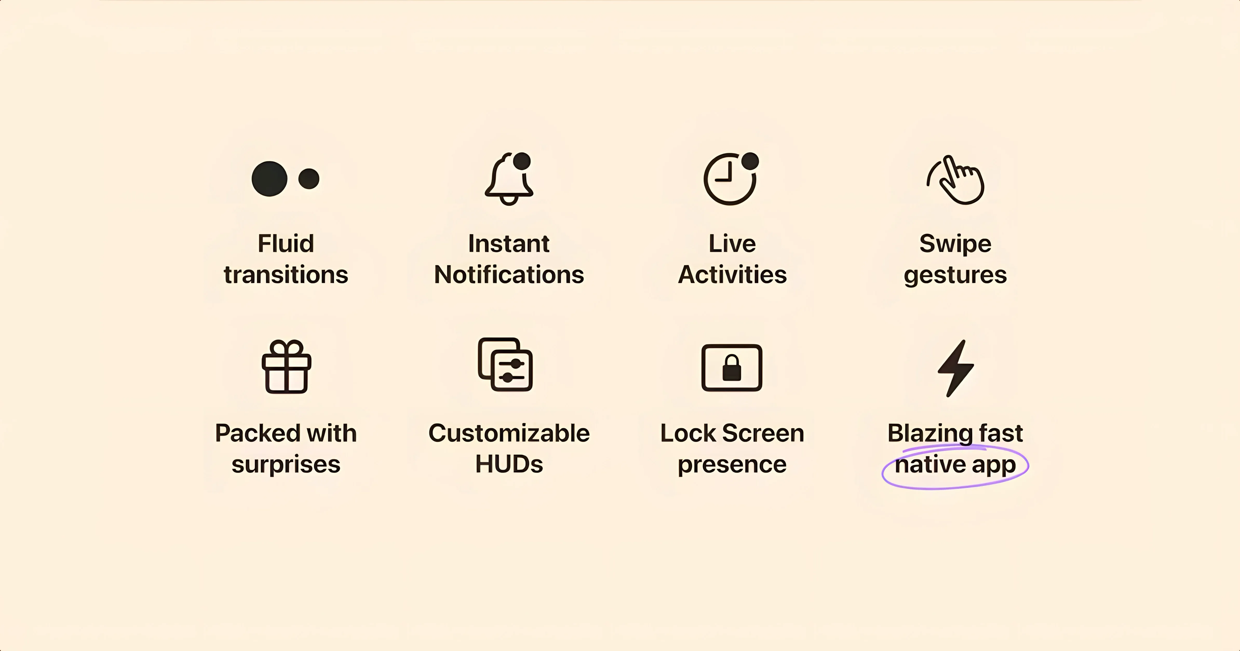
That custom volume HUD replacing the stock macOS overlay is the first sign Alcove isn't just a cosmetic tweak. Henrik Ruscon's app takes the hardware notch on modern MacBooks and borrows a trick from the iPhone, wrapping system events and interactions into a responsive capsule that lives right where you'd normally ignore a black cut-out.
Anchor media and notifications
Playback controls from Apple Music or Spotify, incoming message alerts, and ongoing Live Activities appear inside the pill-shaped Dynamic Island area rather than floating elsewhere on the desktop. A quick click expands details; a swipe dismisses them.
Swap the standard HUDs
Brightness and volume adjustments use Alcove's own sleek indicators instead of the chunky system ones, keeping everything compact and glanceable at the top edge of the screen. The change is subtle at first, then quickly becomes the sort of thing you miss when it isn't there.
Keep it local
Alcove runs natively on both Apple Silicon and Intel Macs on macOS 14 or later. Once installed, remember to switch off automatic updates so the app stays put in the version you intended.
How Alcove sits among similar Mac notch utilities
The idea of making the MacBook notch useful isn't new, but the approaches vary considerably. Alcove leans hard into the Dynamic Island metaphor, treating the notch as a reactive capsule for live events. Compare that with NotchNook, which turns the area into a pull-down shelf for shortcuts, calendar widgets and music controls — more of a mini-dashboard than an alert zone. NotchNook is broader in scope but doesn't replicate the fluid expand-and-contract animation cycle that Alcove borrows from the iPhone. It feels like a utility drawer; Alcove feels like a living part of the display.
MediaMate takes yet another angle. Rather than occupying the notch itself, it overhauls the system's volume and brightness heads-up displays with slim, custom bars that appear near the notch area. It does that one job beautifully, and if all you want is to banish Apple's chunky HUD overlays, MediaMate is a focused choice. What it doesn't do is handle notifications, playback alerts or Live Activities. Alcove covers that ground while also replacing the HUDs, so it effectively bundles MediaMate's core trick with broader event handling. The trade-off is a slightly heavier on-screen presence — you're committing to a capsule that lives in the notch rather than a transient HUD replacement.
Then there's DynamicLake Pro, which is closest in spirit to Alcove but more aggressive in ambition. It adds system-monitoring readouts, clipboard history and a web-app launcher into the notch area, pushing well beyond media and notifications. For users who want a full command centre tucked into the camera cut-out, it's compelling. Alcove's restraint is arguably its strength here: it does fewer things but each one feels polished and phone-familiar. You're not learning a new interaction grammar; you're using the one you already know from the iPhone, just on a larger screen.
A typical session, step by step
Imagine settling in with a MacBook Pro on a weekday morning. Alcove launched automatically at login, so the notch already sits quietly as a thin black strip. You press a volume key on the external keyboard. Instead of the square, opaque system overlay that usually appears dead centre, a slender pill expands from the notch showing a speaker icon and a level bar. You tap the key twice more — the bar animates smoothly, then retreats after a second. No desktop clutter.
Later, a Slack message arrives. The notch swells into a wider capsule with the sender's name and a message preview, then settles back. You click the capsule and it expands into a small popover with the full text and a reply button. A reply isn't needed, so you swipe it left and it disappears. Around lunchtime, a track change in Apple Music triggers another brief expansion — album art on the left, track title in the centre, a tiny pause button on the right. Clicking pause stops playback without switching to the Music app. A second click resumes it.
Mid-afternoon, a timer you set on the iPhone appears as a Live Activity in the notch — a countdown ring and the label "Pasta". You glance at it between paragraphs. When the timer ends, the capsule pulses gently with a chime. The whole session feels less interrupted than the stock macOS experience, because the information arrives in a consistent, small footprint at the top edge rather than bouncing between Notification Centre banners, the menu bar and the Dock.
Small conveniences worth knowing
A few details in Alcove are easy to overlook during the first days of use. The swipe-to-dismiss gesture works on any expanded capsule, but a two-finger swipe dismisses even the collapsed pill — handy when a notification overstays its welcome and you want the notch clear immediately.
The volume and brightness HUDs respond to Option-key adjustments: holding Option while tapping brightness opens Displays System Settings directly from the expanded pill; Option plus volume jumps to Sound settings. It's a subtle bridge between the custom overlay and the system preference panes, and it saves a trip through the Apple menu.
Playback capsules show a rewind and fast-forward control only when you hover near the edges of the expanded pill — mid-capsule keeps it clean, edges reveal the extras. And if you use AirPods with automatic switching, the notch briefly shows a headphone icon and the device name whenever the audio route changes. It's the sort of small affirmation that stops you wondering whether the switch actually happened.
For those who find the constant animation distracting, a Reduce motion toggle inside Alcove's preferences swaps the smooth expand-contract cycle for a simple fade transition. The information stays the same but the visual footprint feels quieter, closer to a traditional notification badge.
Who benefits most from Alcove
Alcove clicks hardest for people who spend long stretches in a single app — writers, coders, designers working full-screen in Xcode, Final Cut Pro or a writing environment. These users tend to resent full-screen interruption banners and appreciate having playback, volume and incoming messages compressed into a territory the screen already surrenders to the notch. The capsule becomes a glanceable companion rather than a pop-up adversary.
iPhone users who have adapted to the Dynamic Island on the handset find Alcove immediately legible. The design language carries across intact, and muscle memory for tap-to-expand and swipe-to-dismiss transfers with zero friction. It's a rare case where a Mac utility feels like a natural extension of something you already use rather than a separate piece of software to learn.
People who juggle media and messaging — switching between a DAW and Slack, or editing video while keeping an eye on a live sports score — get concrete value from the Live Activities support. A running timer, a delivery tracking update or a football score sitting quietly in the notch removes the temptation to check the phone every few minutes. The information is just there, in peripheral vision, without demanding a window or a Notification Centre pull-down.
Less obvious but equally valid: anyone who simply finds Apple's default HUDs intrusive. The stock volume overlay is large, centred and blocks a surprising amount of the screen for a simple adjustment. Alcove's replacement alone might justify the install for users sensitive to that friction, and everything else the app does becomes a bonus layered on top of a cleaner HUD experience.
- macOS 14 or later
- Apple Silicon and Intel Macs
Questions I keep hearing
What actually appears in the Dynamic Island on a Mac?
Media playback controls, notifications, and Live Activities all show up in a capsule at the top of the screen, alongside custom replacements for the stock brightness and volume HUDs.
Questions from the class 0
Sign in or join the class to ask a question.
Nobody has asked anything yet. If you have used it on a real job, say what the file did.
Also on the Mac Apps shelf
The whole Mac Apps shelf AlDente
Limits your MacBook battery charge to a chosen level for longer lifespan.
AlDente
Limits your MacBook battery charge to a chosen level for longer lifespan.
 Airflow
Queues up local video files for uninterrupted, hands-off playback.
Airflow
Queues up local video files for uninterrupted, hands-off playback.
 AirBuddy
Shows your AirPods battery status instantly in the menu bar.
AirBuddy
Shows your AirPods battery status instantly in the menu bar.
 Aiarty Video Enhancer
Lifts old, grainy video into clearer, watchable footage.
Aiarty Video Enhancer
Lifts old, grainy video into clearer, watchable footage.
 Aiarty Image Enhancer
Cleans up noisy or soft photos with targeted detail reconstruction.
Aiarty Image Enhancer
Cleans up noisy or soft photos with targeted detail reconstruction.
 AI Transcription
Converts batches of spoken recordings into searchable written text.
AI Transcription
Converts batches of spoken recordings into searchable written text.
 Antivirus Zap - Virus Scanner
Scans your Mac for malware, adware and unwanted files lurking in the system.
Antivirus Zap - Virus Scanner
Scans your Mac for malware, adware and unwanted files lurking in the system.
 AnyTrans for iOS
Moves photos, messages and music between iPhone, Mac and cloud accounts.
AnyTrans for iOS
Moves photos, messages and music between iPhone, Mac and cloud accounts.