 ASPNetWorld

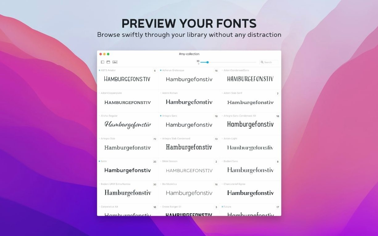
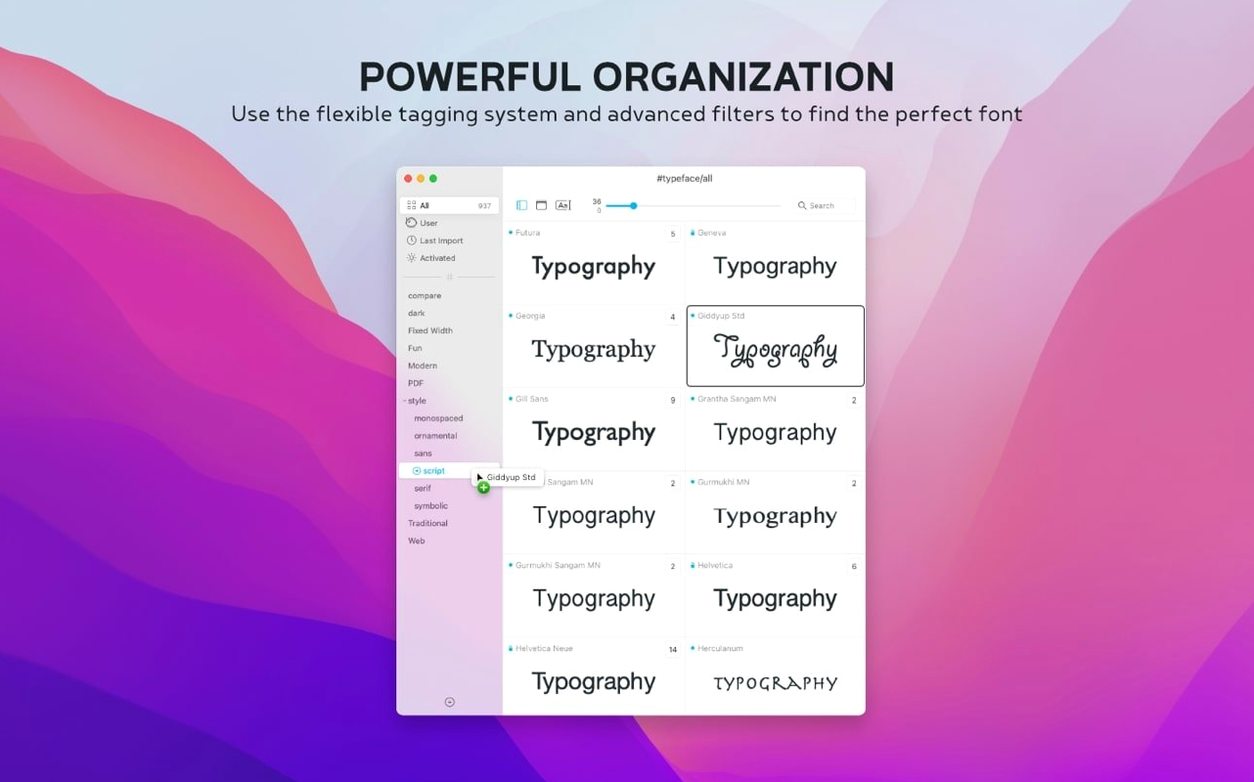
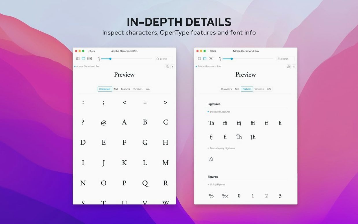
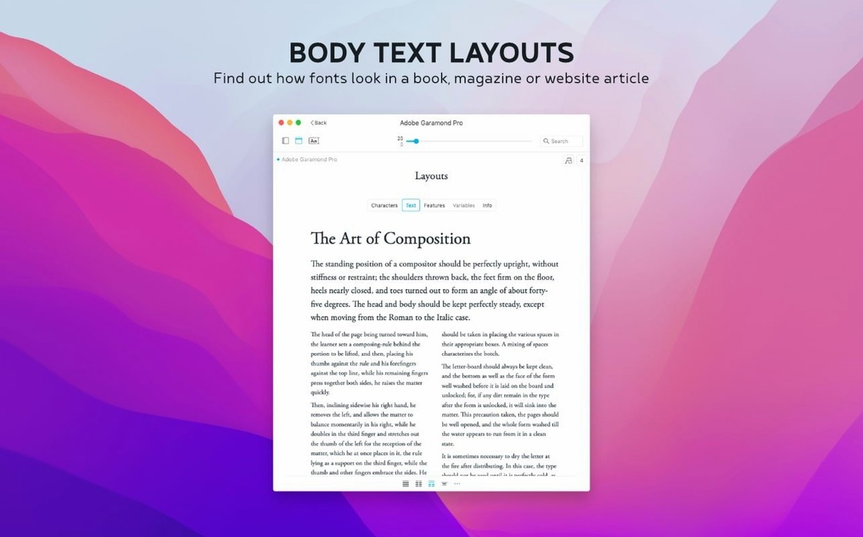
Somewhere in a designer's library sits a folder named 'to sort' with 47 fonts, three of which are actually the same Clarendon under different filenames. Typeface turns that chaos into a quiet afternoon of comparing, tagging and discarding — and version 4.5 makes the process sharper with a handful of refinements.
Paring down a shortlist: one realistic pass
1. Launch Typeface and import the unruly folder. You can drag fonts straight from the Finder, pull them from another font manager, or grab files off the web — the app doesn't mind where they come from. Everything lands in the overview as a scrollable grid of specimen cards.
2. Type a sample sentence into the preview bar. Rather than the pangram everyone defaults to, try actual copy from the project you are working on — a heading, a pull quote, a button label. The grid updates instantly, so you can scan 40 renderings of the same phrase without opening a single menu.
3. Start culling. Click a card to see the full glyph set — uppercase, lowercase, numerals, special characters — at any size you like. If a face falls apart at small sizes or lacks a proper @ sign, you know immediately.
4. Tag the keepers. A single font can belong to several groups: 'serif-display', 'client-pitch', 'narrow-column'. Tags are freeform, so you build your own taxonomy rather than fighting someone else's folder structure.
5. For the serious contenders, open the Info tab and use the new Notes field. Jot down impressions while they are fresh: 'too spiky at 10pt', 'works beautifully with Montserrat', 'check licence for web embedding'. The notes are now searchable from the overview, which means you can pull up every font you've annotated with 'magazine body' in one keystroke.
6. Sort the remaining shortlist by the Last Activated column — another 4.5 addition — to see which faces you actually reached for during the session. The ones you never activated are probably safe to archive.
The grid stays fluid even with hundreds of imported Google Fonts
There is a particular pleasure in software that stays out of your way. Typeface loads in under two seconds on an Apple Silicon machine, even with a library swollen by several hundred imported Google Fonts. Scrolling through the specimen grid stays smooth — no jitter, no beachball — because the app draws previews on demand rather than rendering every card in advance. Memory use hovers modestly around 180 MB during typical browsing and doesn't climb appreciably when you add more faces to the overview. On older Intel hardware I've seen it sit closer to 220 MB, which is still restrained for a tool that is effectively running a miniature typesetting engine behind every thumbnail.
Stability is equally uneventful, in the best sense. Through a morning of importing, tagging and comparing, I haven't provoked a crash. The one fragile moment comes when you drag in a corrupted font file — Typeface will sometimes pause briefly, then skip it without complaint, leaving the rest of the batch intact. That quiet resilience matters when you're working through a thousand-file typeface torrent and don't have time to preen every entry beforehand.
Importing 3,000 fonts at once turns the specimen grid into overwhelming noise
A new user's first instinct is often to import everything. Every free font pack, every dusty backup folder, every woff file pulled from a web inspector. Typeface will handle it, but a grid of 3,000 specimens stops being a design tool and becomes a landfill. Start small — a single project's worth, or the contents of one clearly named folder — and build your tagging system gradually. Tags earn their keep only when they're specific. Labelling something 'sans-serif' is about as useful as filing a document under 'paper'.
Another common misstep is ignoring the Info tab entirely. Each font carries metadata — designer, foundry, licence history, copyright — and Typeface surfaces it without fanfare. A quick glance at the copyright field has saved me from speccing a face that was free for personal use but required a commercial licence I didn't have budgeted for. The new Notes field makes this even easier: jot down the licence terms once, and the overview search can recall it months later when the project returns from the dead.
Beginners also tend to trust the default preview size. A display face that looks crisp and commanding at 48 points can turn into illegible porridge at 12. Flip between sizes while the Info tab's glyph grid is open — pay special attention to the numerals and the @ sign, which are often the first characters to betray poor hinting.
A real workflow: choosing a body face for a newsletter
Suppose you're redesigning a quarterly print newsletter. The old body face felt cramped at 10 points on a narrow column, and the editor wants something with warmth but not whimsy. Here's how one pass might go:
1. Open the Google Fonts import panel within Typeface and pull down a selection of serifs and slab serifs — about 30 candidates, from familiar workhorses like Lora and Merriweather to newer options like Source Serif 4. They appear in the overview alongside your existing library.
2. Type a representative paragraph into the preview bar. Not a pangram, not lorem ipsum — three lines of actual newsletter copy, including an em dash, a percentage sign and a pair of smart quotes. The grid refreshes and suddenly you're comparing real typesetting, not abstract letterforms.
3. Set the preview size to 10 points and start eliminating. Faces that look wiry or uneven at this size are struck from the shortlist. Use the side-by-side comparison view to place two remaining contenders next to each other — the differences in x-height and aperture that were subtle in isolation become unambiguous.
4. Tag the survivors with 'newsletter-body'. Open each one's glyph set and check that the figure style matches the editor's preference — tabular figures for tables, or proportional figures for running text. Typeface shows both if the font contains them.
5. For the final three, write a short note in the Info tab: 'good spacing at 10/14', 'slightly dark on coated stock', 'check old-style figures'. Activate each in turn while you prepare a specimen sheet in your layout app, then return to Typeface and sort by Last Activated. The face you kept returning to is probably your answer.
What the 4.5 refinements change day to day
The .otc font collection support added in version 4.5 closes a small but persistent gap. Mac system fonts ship in .ttc containers, and .otc is the OpenType equivalent — common in East Asian typefaces and some large foundry collections. Before 4.5, users who worked with Japanese or Chinese fonts often had to unpack these files with a separate utility before Typeface could read them. Now the app opens them directly, which saves a step during import and means the overview reflects exactly what is in the container, not a manually reconstructed subset.
The Last Activated column shifts the way you audit your own choices. Previously, you could sort by date added or by family name, which told you nothing about which fonts you actually used during a design session. Now the column records every activation, and sorting by it surfaces the faces you reached for instinctively — a lightweight proxy for taste that is often more honest than your own mental shortlist. Combined with the searchable Notes field, it becomes straightforward to revisit a font you annotated six weeks ago, see that you activated it seventeen times since, and confirm it deserves a permanent slot in a collection.
None of these changes are dramatic in isolation. Together, they nudge Typeface further from a passive catalogue and closer to something that records your working relationship with a type library — what you tried, what you noted, what you kept returning to.
Typeface 4.5 sharpens the organisational side of font browsing. You can now attach free-text notes to any font in the Info tab, and those notes are searchable directly from the overview. A Last Activated column lets you sort your library by when each face was last used, while .otc font collection files are now supported alongside the existing formats.
- macOS 12 or later
- Apple Silicon and Intel Macs
Questions from the class 0
Sign in or join the class to ask a question.
Nobody has asked anything yet. If you have used it on a real job, say what the file did.
Also on the Mac Apps shelf
The whole Mac Apps shelf Tuxera NTFS
Lets your Mac read and write Windows-formatted drives without a second thought.
Tuxera NTFS
Lets your Mac read and write Windows-formatted drives without a second thought.
 TunesKit iPhone Unlocker
Removes a forgotten screen passcode or an Apple ID from a locked iPhone.
TunesKit iPhone Unlocker
Removes a forgotten screen passcode or an Apple ID from a locked iPhone.
 Trimma
Trims the start or end off a video without opening a library or creating a project.
Trimma
Trims the start or end off a video without opening a library or creating a project.
 Transmit
Moves files between your Mac and remote servers through a fast, dual-pane browser.
Transmit
Moves files between your Mac and remote servers through a fast, dual-pane browser.
 Unclutter
Collects your clipboard history, recent files, and quick notes in one swipe-down panel.
Unclutter
Collects your clipboard history, recent files, and quick notes in one swipe-down panel.
 TouchDesigner
Assembles real-time visuals by wiring together operators for points, textures and geometry.
TouchDesigner
Assembles real-time visuals by wiring together operators for points, textures and geometry.
 Vector Magic
Converts bitmap images into clean vector graphics you can scale forever.
Vector Magic
Converts bitmap images into clean vector graphics you can scale forever.
 Topaz Video AI
Reconstructs watchable detail from old, low-quality video footage frame by frame.
Topaz Video AI
Reconstructs watchable detail from old, low-quality video footage frame by frame.