 ASPNetWorld
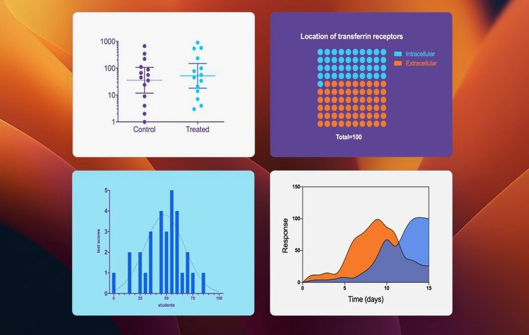
There is a particular frustration in research when your statistical software, graphing tool and curve-fitting routine live in separate places, each with its own file format and its own way of thinking about your data. GraphPad Prism was built to bring those three jobs together so you can design an experiment, run the right analysis and produce a publication-quality graph without switching contexts.
Does Prism help me pick the correct statistical test?
Yes, it includes built-in guidance that explains which test suits your experimental design and how to interpret the output. Rather than hunting through a textbook, you get plain-language explanations alongside the results, which is especially helpful when you are teaching yourself a new analysis.
Can I manage repeated experiments inside one file?
Absolutely. Prism organises replicate data logically, so you can keep every repeat of an experiment in a single project, compare them, and present the pooled analysis clearly. This avoids the classic mess of scattered spreadsheets where it is easy to lose track of which run is which.
What makes the nonlinear regression worthwhile?
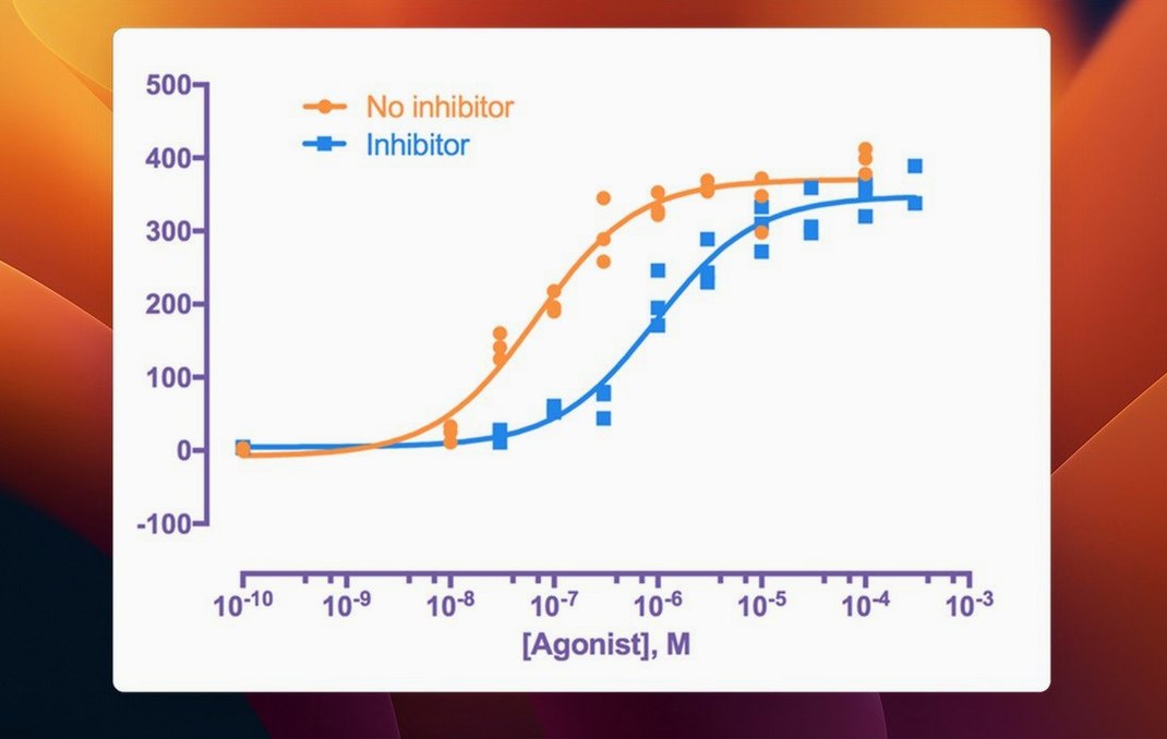
It is one of the application's strongest suits. You get a large library of equations to choose from, plus the ability to define your own, with sensible automatic starting values and clear diagnostics. If you routinely fit dose-response curves or enzyme kinetics, this alone can save you a good deal of time and head-scratching.
Native Apple Silicon support requires macOS 11 or later
Yes, Prism 11 runs natively on both Apple Silicon and Intel 64-bit Macs. It requires macOS 11 or later, so most Macs from the last several years are covered without any emulation overhead.
Let me walk you through a full workflow that shows how the pieces connect in practice. Imagine a pharmacologist who has just run a dose-response experiment across three independent occasions, each with six concentrations and triplicate wells. She has the raw absorbance values in a spreadsheet, but the aim is a finished figure that shows the pooled IC50 with confidence bands and a clear ANOVA comparison of the repeats.
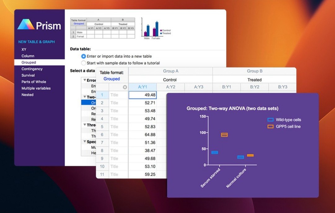
She opens Prism and chooses the XY table type, then tells the welcome dialog that she has three replicates for each point. The table appears with rows for concentration and columns for each repeat. She pastes the raw absorbances from her lab notebook, labels the concentrations in the leftmost column, and clicks the green analyse button. From the list of analyses she picks Nonlinear regression – dose-response – Inhibition and asks Prism to fit one curve for each repeat. The report appears within seconds, complete with goodness-of-fit metrics and a table of IC50 values with 95% confidence intervals.
Next she wants to test whether the three repeats gave genuinely different IC50 estimates. She goes back to the data table, opens the Insert menu, and creates a grouped graph of the extracted parameters. A one-way ANOVA on the IC50 values tells her the repeat-to-repeat variation is no larger than you would expect by chance, so she returns to the nonlinear regression dialog and checks the box to pool the three experiments into a single global fit. Prism overlays the combined curve on a fresh graph, shades the confidence band, and she adds a title and axis labels that match her target journal’s style. The whole process, from raw numbers to export-ready TIFF, takes perhaps fifteen minutes.
Multiple variables tables gain new graph types
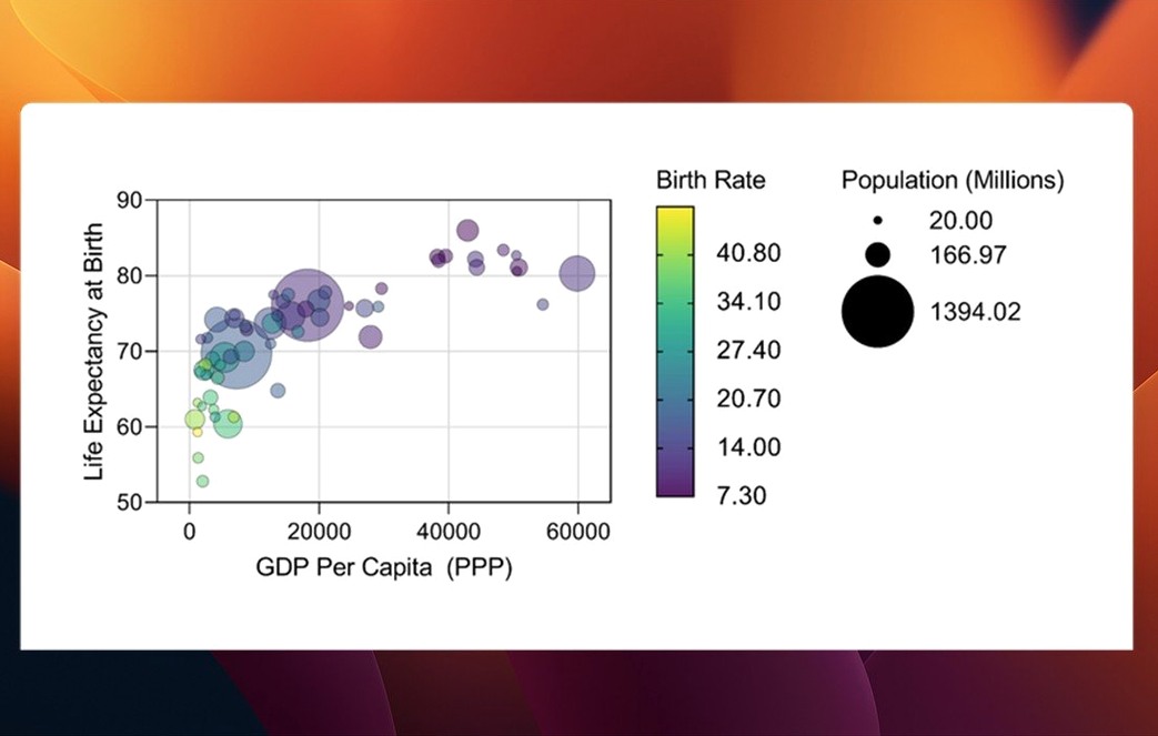
The update to 11.1.0 does not rewrite the way you use Prism, but it removes several small frictions that added up over a working day. The most visible change is the new graph types for multiple variables tables. Instead of having to reshape your data just to get a box-and-whisker plot or a violin plot, you can now stay inside the multiple variables structure and create those graphs directly. For anyone who tracks several response measures across treatment groups, this means fewer copy-and-paste misadventures.
Categorical level ordering has quietly tidied up something that used to need workarounds. In earlier releases, Prism would often sort your treatment groups alphabetically on the graph regardless of the logical order you wanted. Now you can drag categories into a sequence that makes scientific sense – vehicle, low dose, medium dose, high dose – and the graphs and analyses respect that order. It sounds trivial until you have spent twenty minutes reordering figure panels for a submission.
Inside the analysis dialogs, variable selection is noticeably less cluttered. When you run a t test, a multifactor ANOVA, nonlinear regression, or a simple survival analysis, the parameter dialogs now present the available variables more clearly, with less scrolling and fewer dropdowns that contained every column in your project. The change is especially welcome in large multifactor designs where the old list could feel like a spreadsheet that had got out of hand.
Under the surface, more than sixty bug fixes shipped with 11.1.0. The ones I hear about most often are around graph export at high resolution and occasional crashes when switching between very large data tables, both of which now behave as you would expect.
First days on a new installation
Once you have dragged Prism from the disk image into your Applications folder and launched it, spend your first hour on three things that will pay off for months.
First, open the Preferences and set your default graph appearance. Choose a font, a colour palette for grouped data, and the size of your axis tick labels. Every graph you make afterwards will inherit these choices, so you avoid the repetitive clicking that eats into a morning when you are preparing several figures at once.
Second, create a template project for your most common experimental design. If you run dose-response curves every week, set up a project with an XY table, the nonlinear regression analysis already attached to it, and a graph sheet that shows the fitted curve with the confidence band switched on. Save it as a template through the File menu, and your next experiment starts with the analysis half-done. You simply paste fresh numbers and click Analyse.
Third, learn the behaviour of the Magic tool. It sits in the toolbar and tries to make a graph from whatever you have selected, and in version 11 it is genuinely useful rather than a guessing game. Select two columns of a multiple variables table, click the wand, and Prism will propose a sensible graph type. You do not have to accept its first offer, but it often gets you eighty percent of the way there in a single click.
Treat data tables as single‑purpose sheets, not spreadsheets
One of the most frequent errors I see in evening classes is treating the data table like a spreadsheet that should hold every piece of information from the experiment. Prism works best when each table does one job. If you are measuring body weight, tumour volume and survival in the same animal study, make three separate data tables rather than one enormous sheet. The analysis dialogs become easier to navigate, and you will not accidentally run a t test on the wrong set of columns.
Another common slip is ignoring the analysis checklist that Prism displays after you pick a statistical test. The software asks you to confirm that your data meet the assumptions of the test you have chosen – normality, equal variances, independence – and it is tempting to click through without reading. Spend thirty seconds with that dialog. Prism can run normality tests for you right there, and the result might send you toward a nonparametric alternative that saves you from a reviewer’s red pen later.
A third mistake is exporting graphs by taking screenshots. Prism can write vector PDFs and high-resolution TIFFs directly from the Export command, and those files embed the fonts and line weights that journals demand. A screenshot of your screen will be 72 dpi and will look fuzzy the moment it is printed. Set your export resolution to at least 300 dpi for raster formats, or stick with PDF for figures that may need to be resized later.
Finally, new users sometimes assume that because Prism does not require activation, they should keep the disk image file lying around as a backup. Once you have dragged the application into the Applications folder, eject the disk image and tuck the original download somewhere safe. Running Prism from the mounted image can cause permissions quirks and will almost certainly confuse the autosave location.
Version 11.1.0, released in August 2026, focuses on making data structure clearer and analysis setup quicker.
- New graph types are now available for multiple variables tables, giving you more visual options right out of the gate.
- Categorical level ordering can be set for multiple variables data tables, so your groups appear in the sequence that makes scientific sense rather than alphabetical order.
- Variable selection in analysis dialogs has been streamlined for t tests, multifactor ANOVA, nonlinear regression and simple survival analysis, cutting down on repetitive clicks.
- macOS 11 or later
- Apple Silicon or Intel 64-bit processor
Questions I keep hearing
Is GraphPad Prism only for biologists?
While most features grew out of bioscience needs, any discipline that uses repeated experiments, nonlinear regression or publication-ready graphing can benefit from it.
How does Prism 11.1.0 simplify the analysis setup?
The latest version streamlines variable selection inside analysis dialogs for common procedures like t tests, ANOVA and survival analysis, so you spend less time clicking through parameter screens.
Questions from the class 0
Sign in or join the class to ask a question.
Nobody has asked anything yet. If you have used it on a real job, say what the file did.
Also on the Office shelf
The whole Office shelf GrandTotal
Creates clean, custom invoices and estimates free of spreadsheet clutter.
GrandTotal
Creates clean, custom invoices and estimates free of spreadsheet clutter.
 GoodNotes
Brings your handwritten iPad notes to the Mac desktop for editing and organising.
GoodNotes
Brings your handwritten iPad notes to the Mac desktop for editing and organising.
 Final Draft
Formats your screenplay as you type, keeping character names and cues tidy.
Final Draft
Formats your screenplay as you type, keeping character names and cues tidy.
 iA Writer
Clears away every toolbar so only your current sentence stays in focus.
iA Writer
Clears away every toolbar so only your current sentence stays in focus.
 EndNote
Collects, organises, and cites your research references inside a word processor.
EndNote
Collects, organises, and cites your research references inside a word processor.
 Keep It
Gathers notes, web links, images and files into one searchable library on your Mac.
Keep It
Gathers notes, web links, images and files into one searchable library on your Mac.
 DjVu Reader Pro
Opens and lets you read archived DjVu documents and scanned books reliably.
DjVu Reader Pro
Opens and lets you read archived DjVu documents and scanned books reliably.
 Complete Anatomy
Reveals the true spatial dance of nerves and organs that a flat textbook page cannot show.
Complete Anatomy
Reveals the true spatial dance of nerves and organs that a flat textbook page cannot show.